

EMBRACING THE DIGITAL AGE WITH VERSATILE DESIGN
Client
Design Spectrum
What We Did
Rebranding

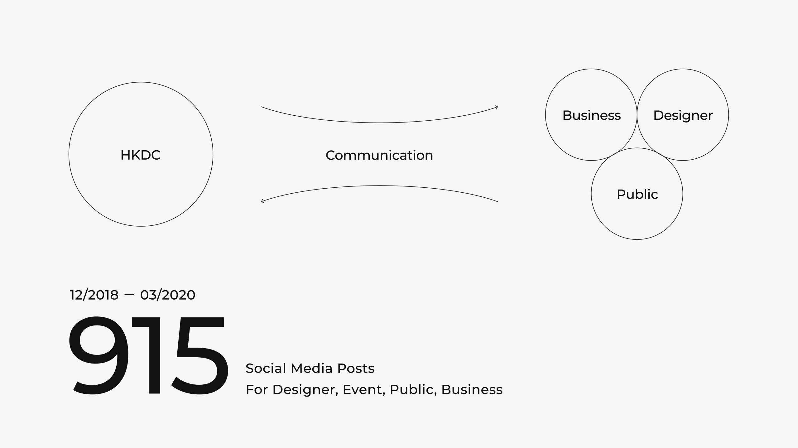
Hong Kong Design Centre has engaged with various groups via social media in the We-media era, with over 900 social posts published between 2018 and 2020. However, Ztory observed that the visual systems of HKDC’s numerous projects differ, causing potential confusion when displayed together.
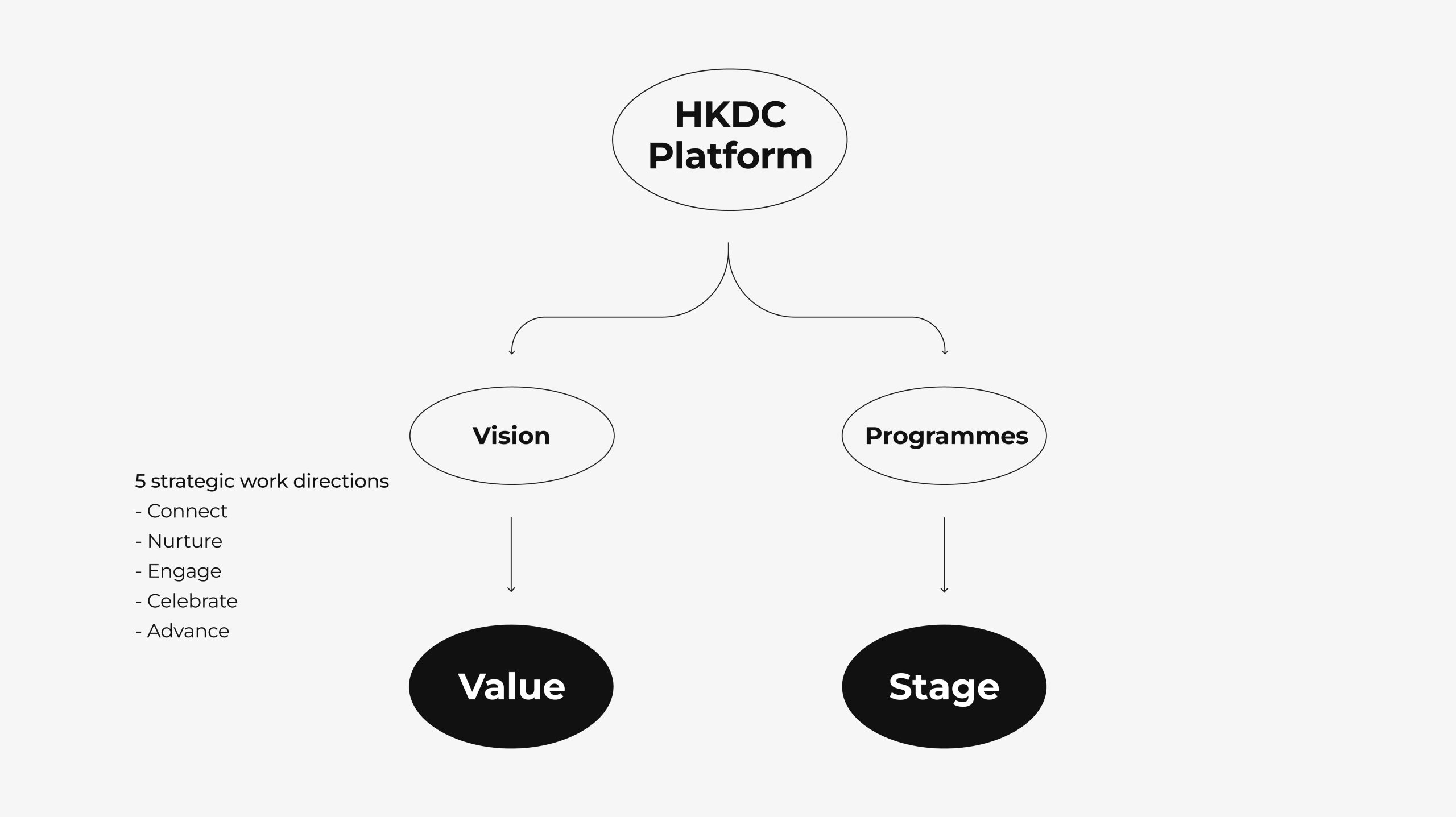
On the other hand, the team also observed that the existing visual image did not fully manifest the position of the Hong Kong Design Centre. In fact, the organisation has been adhering to the five concepts (Connect, Celebrate, Nurture, Advance, Engage). Through different projects and events, HKDC established a platform for the industry to understand, communicate and cooperate with each other, demonstrating the power and value of design.

Design Application
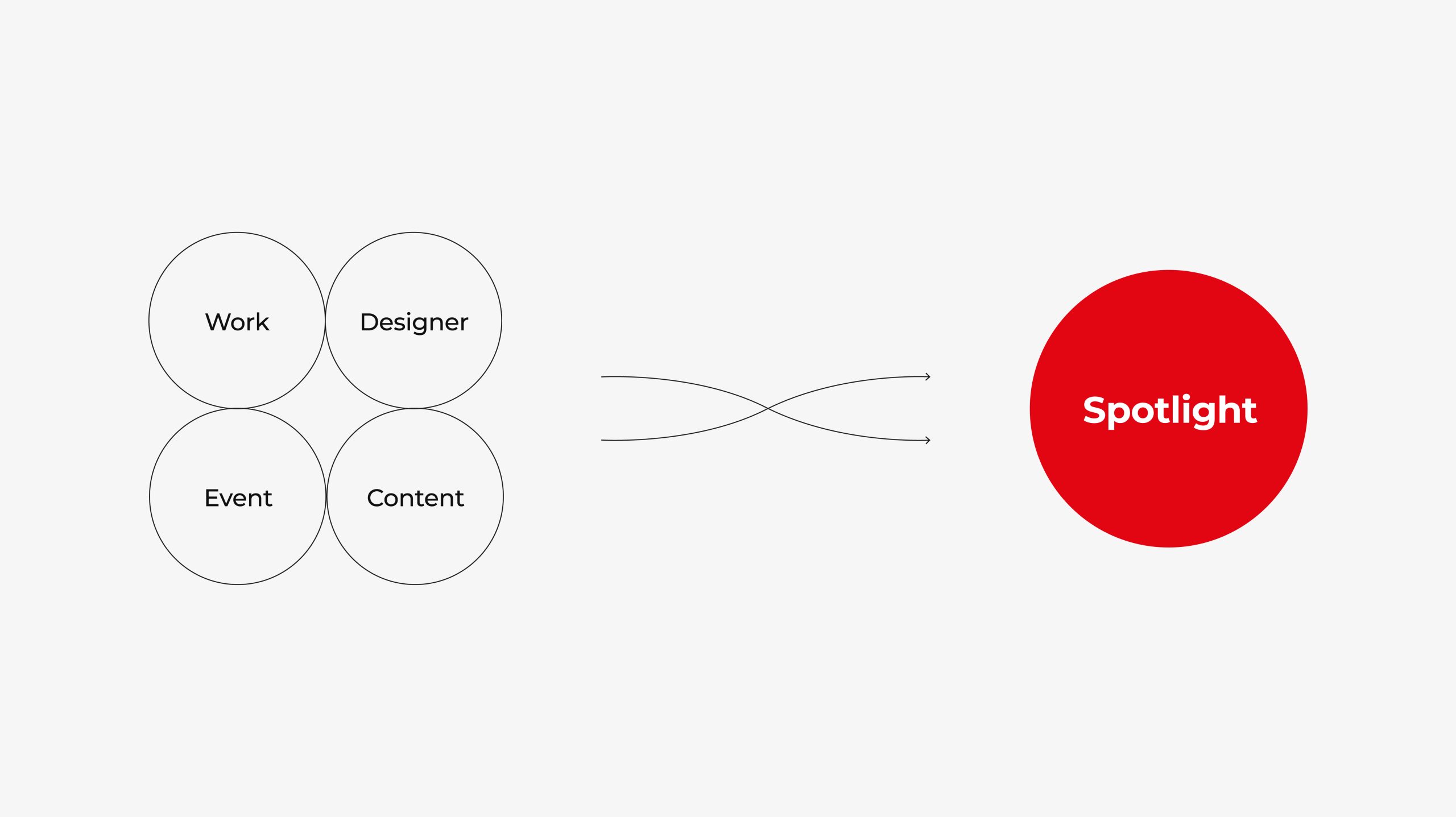
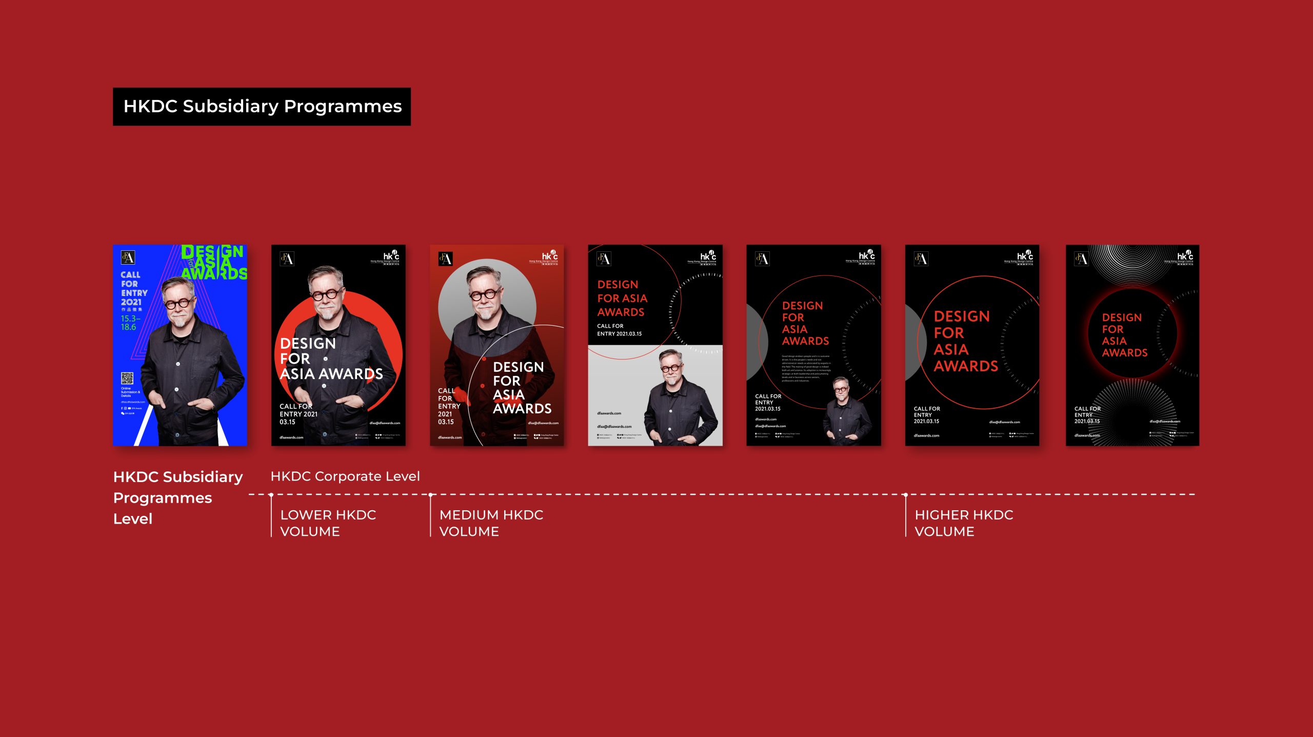
To cater to different needs, Ztory considered the flexibility of the applications of design. The circular elements and the suggested colours should be used freely in different sizes, positioning and colour combinations.
Design Concept and Element


Brand Recognition
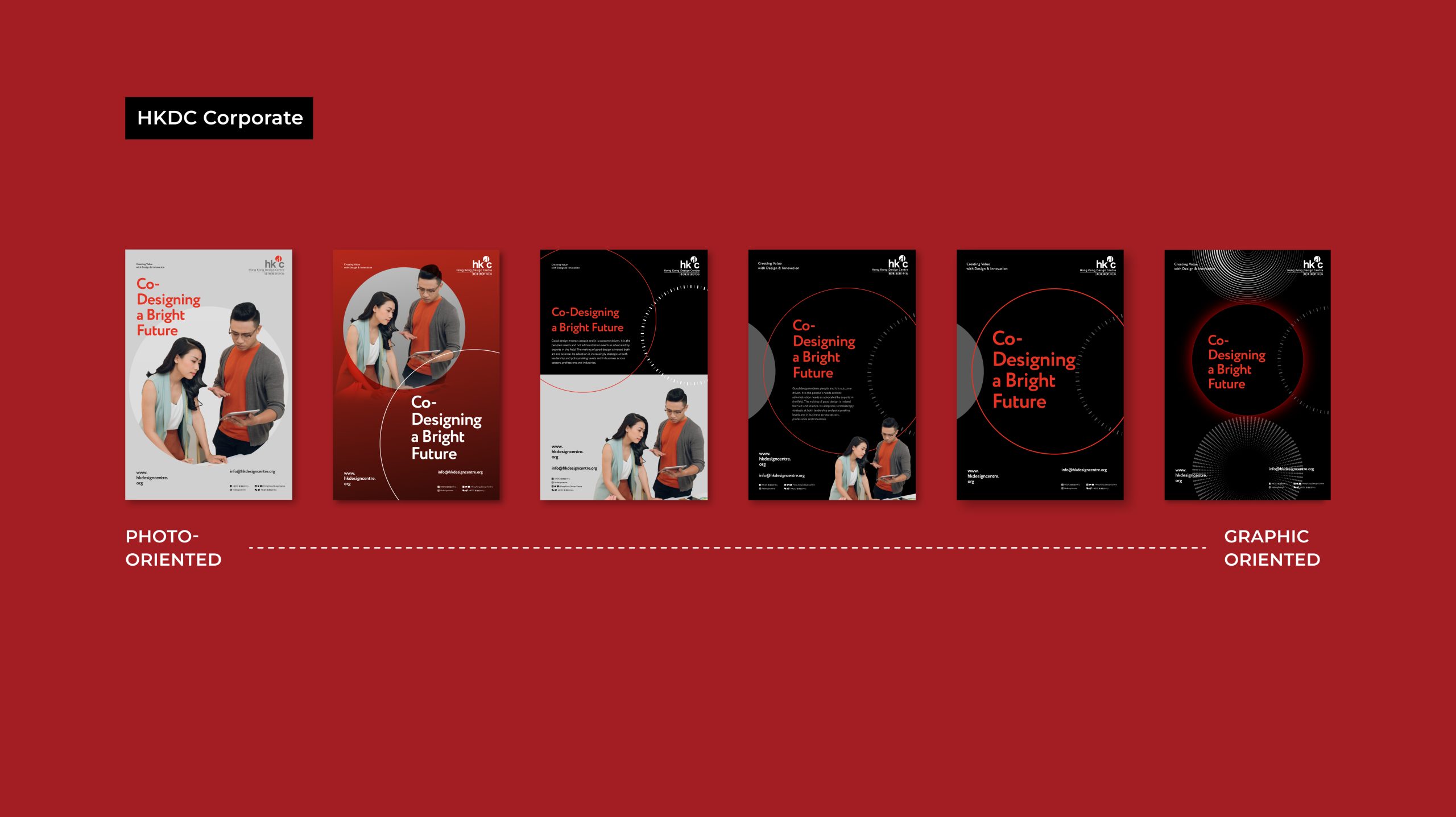
For different positioning and uses, the proportion of images and photos in the visual elements will be adjusted accordingly to correspond to the brand recognition.
A Final Word
Ztory complements the previous visual image through a versatile design, and gives a sense of stylish and vibrant personality to the organisation. The team hopes that Hong Kong Design Centre can make good use of the new visual image to further polish the organisation’s image.


