A BRIEF DISCUSSION ON EVENT VISUAL DESIGN
Client
PMQ
What We Did
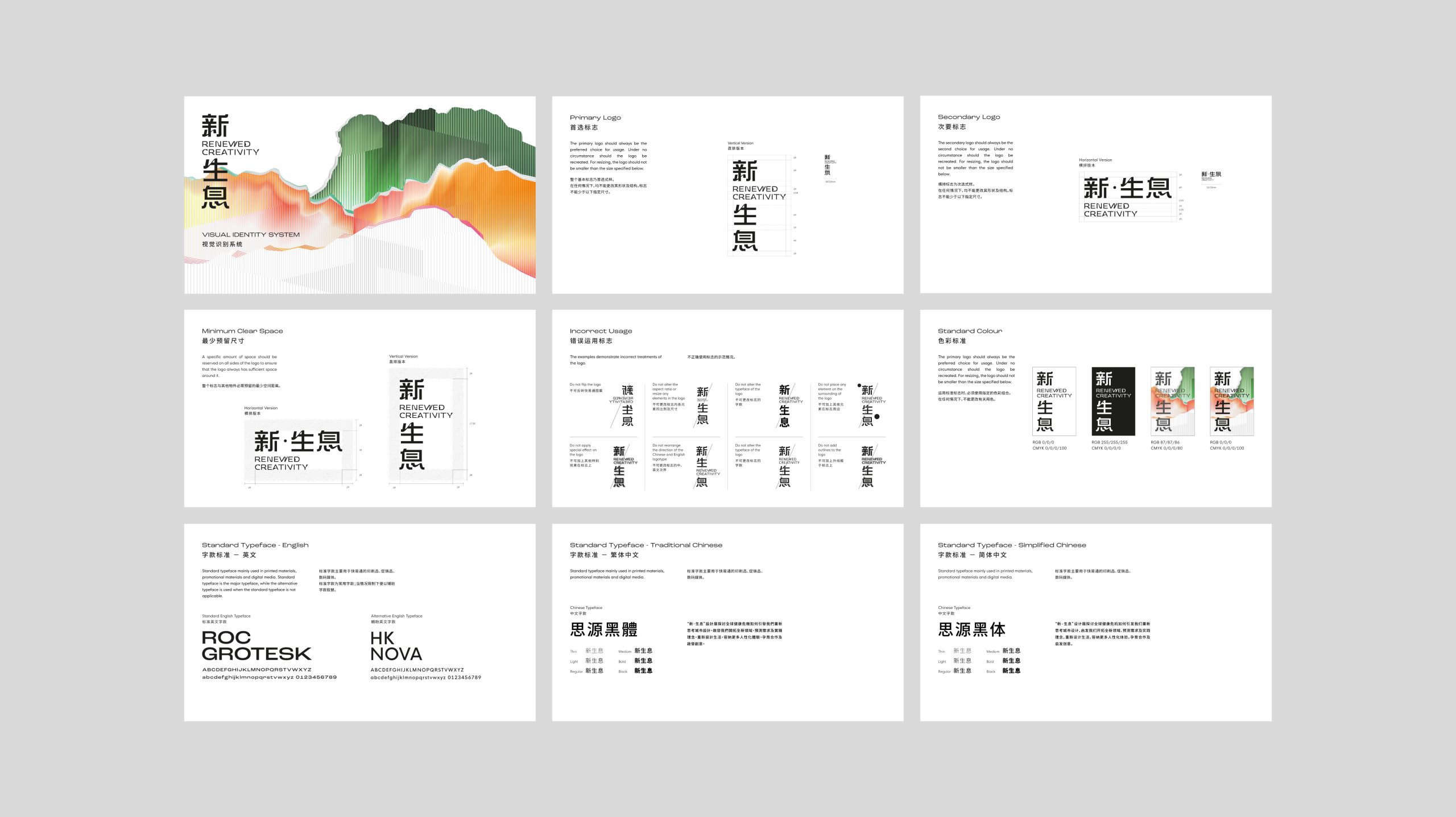
Brand Identity
Editorial Design
Product Design
Web Design
Environmental Design
Design Concept
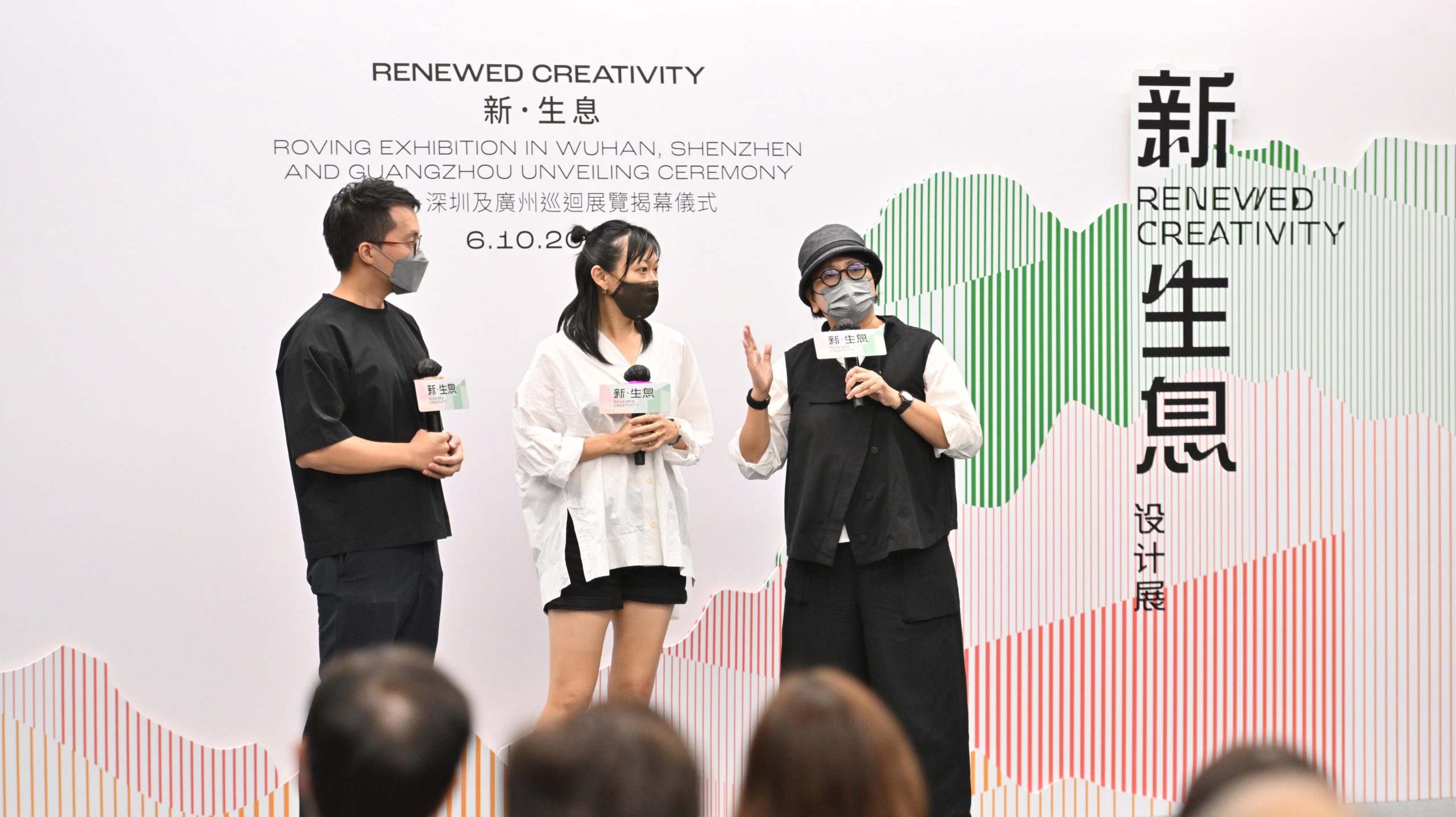
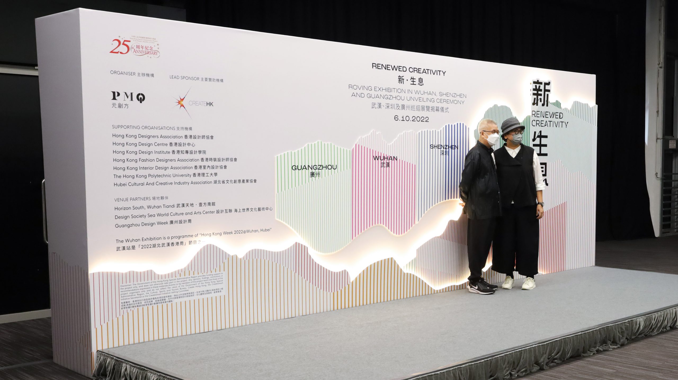
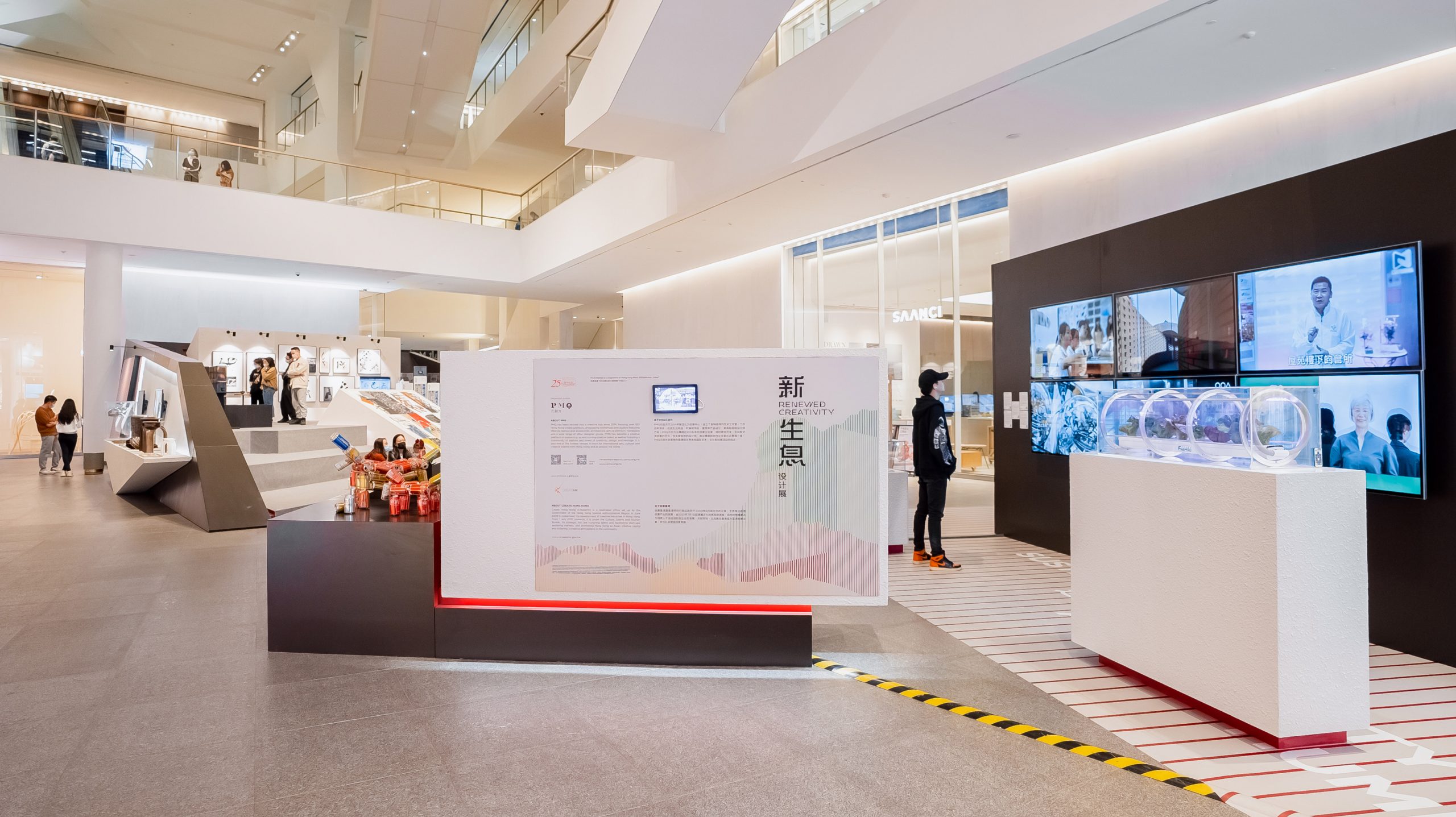
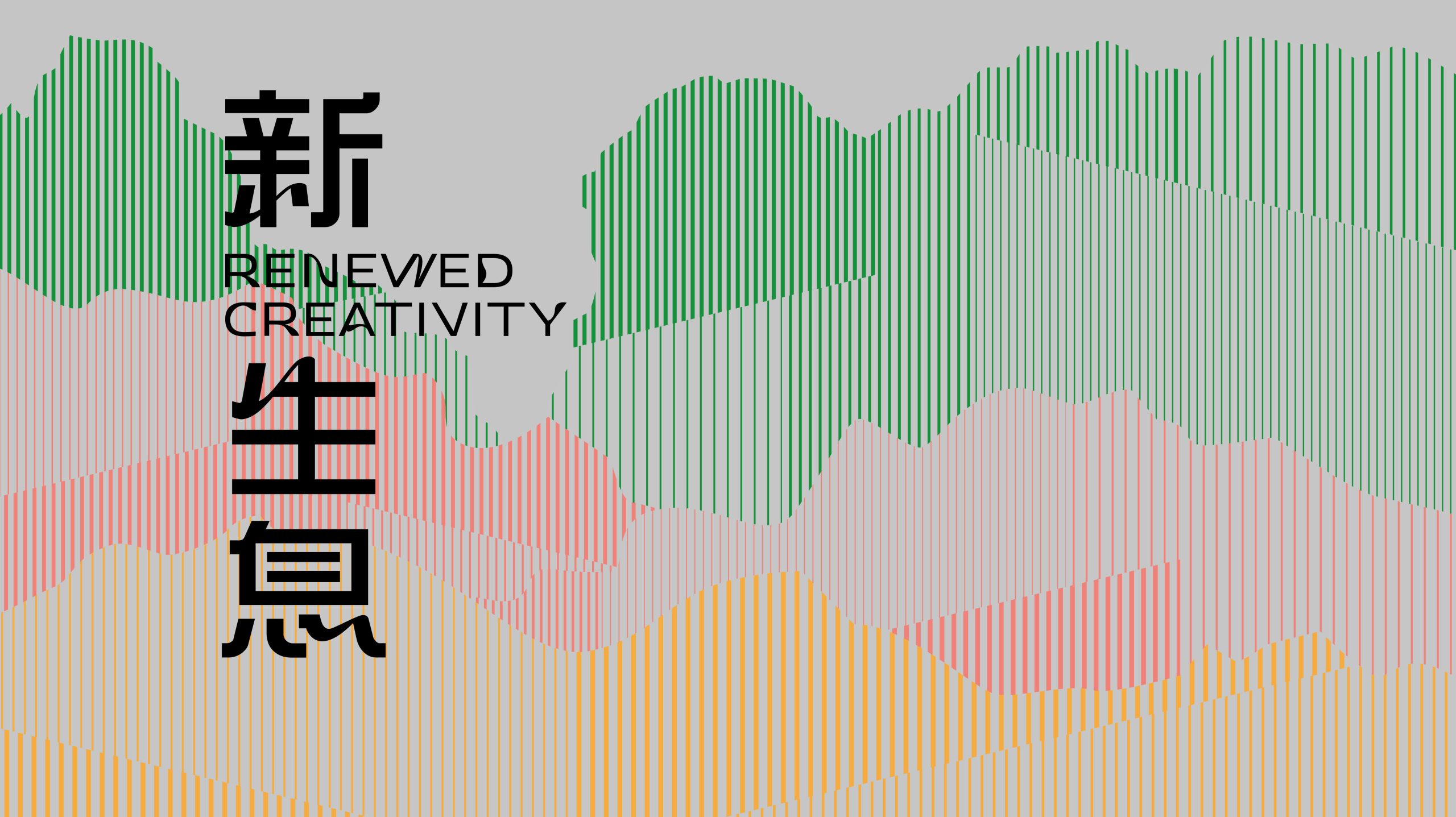
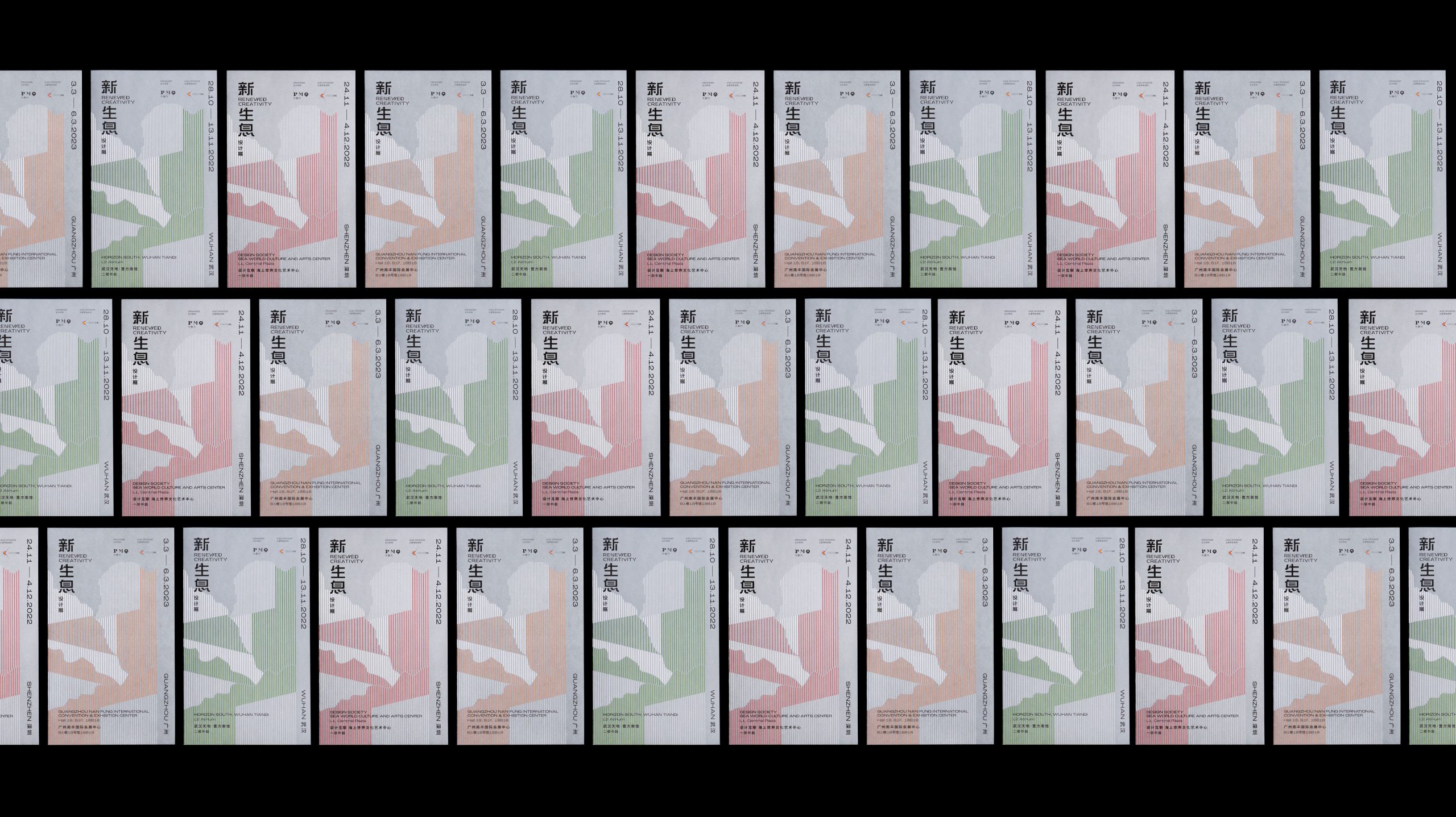
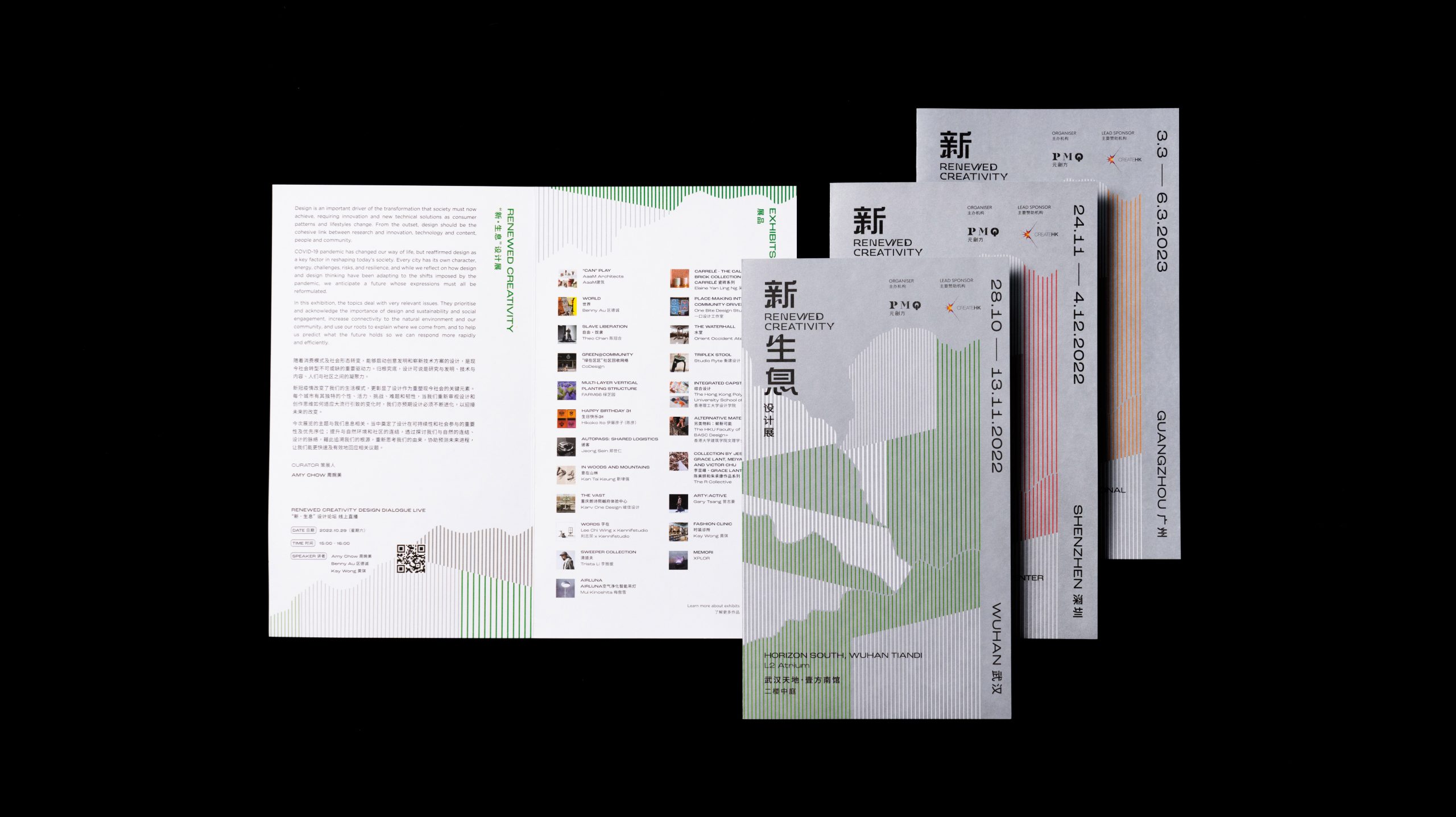
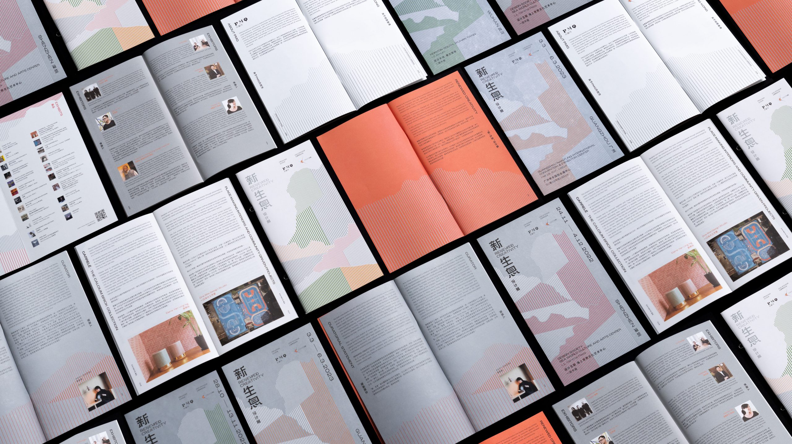
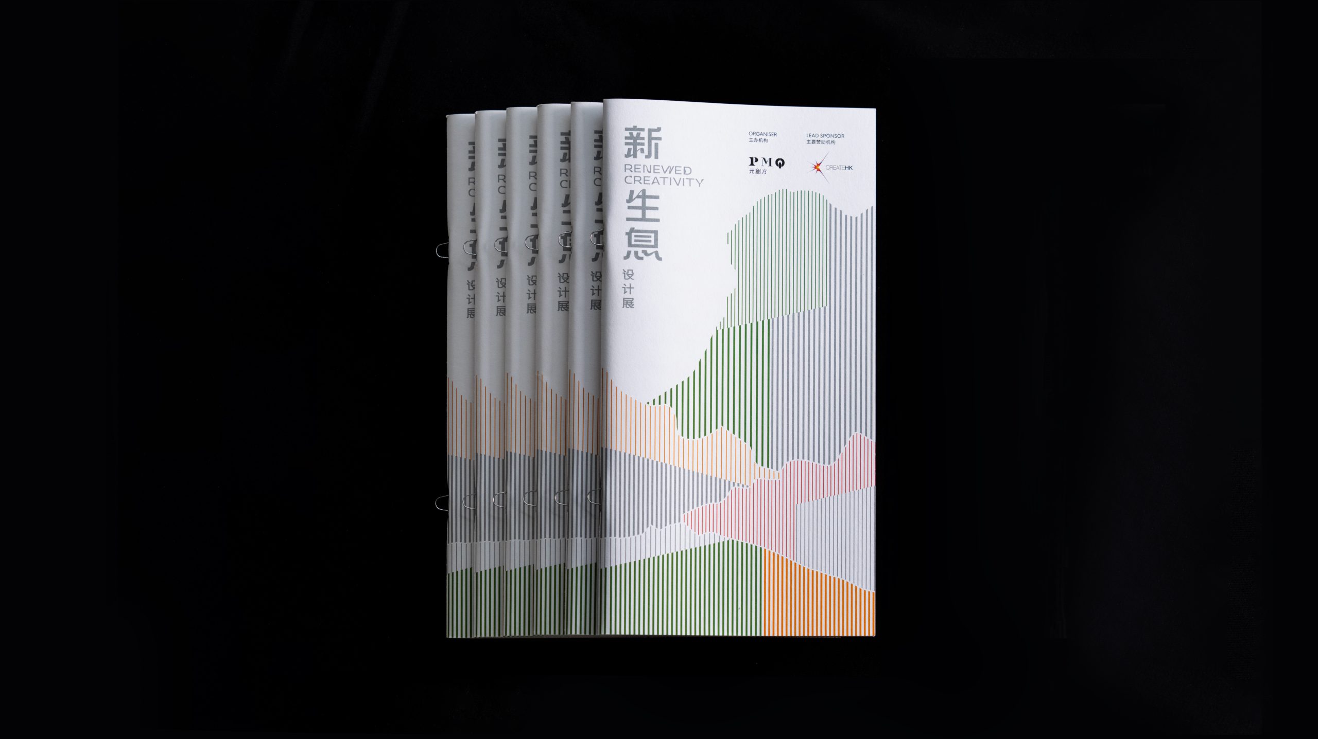
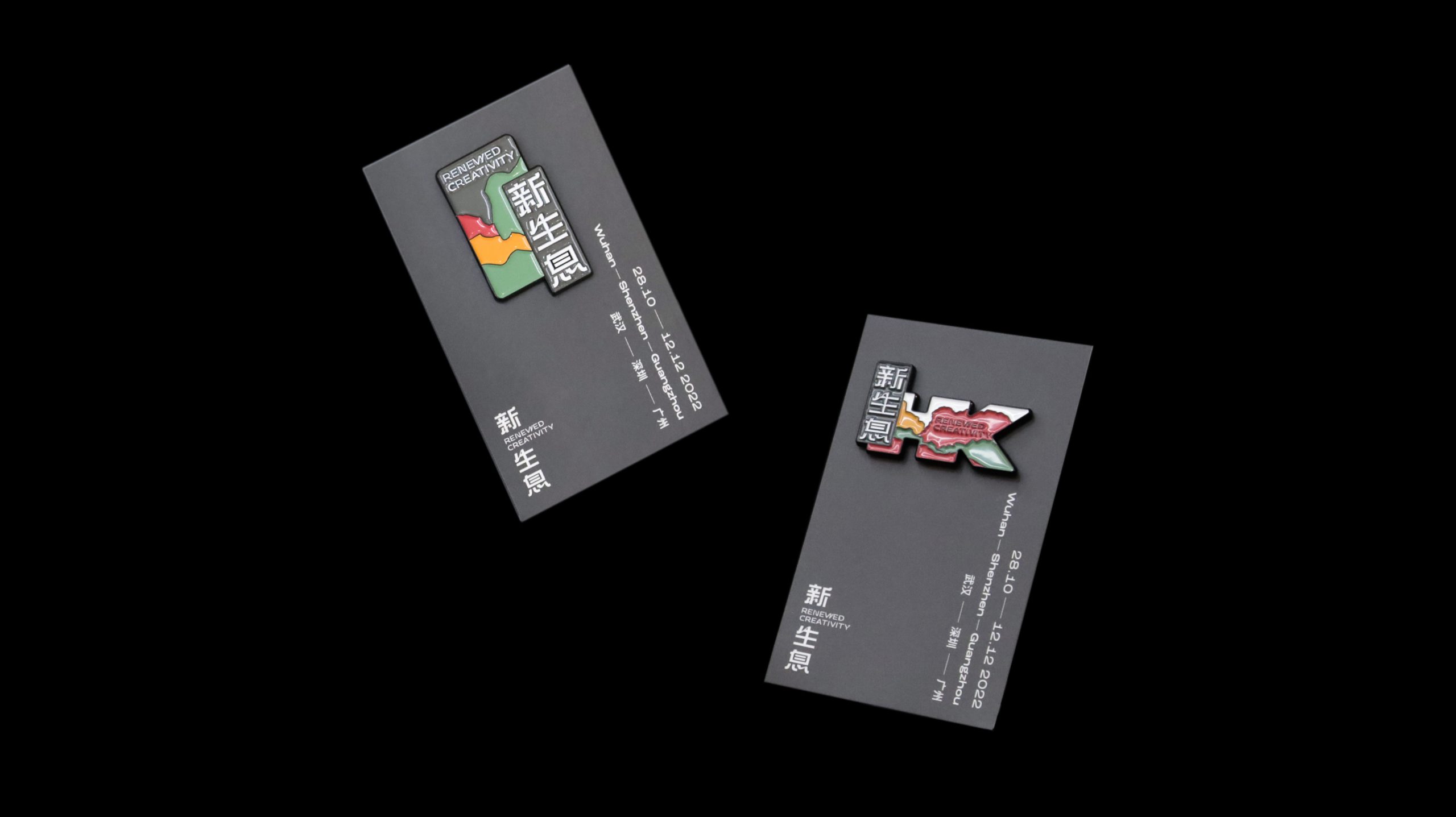
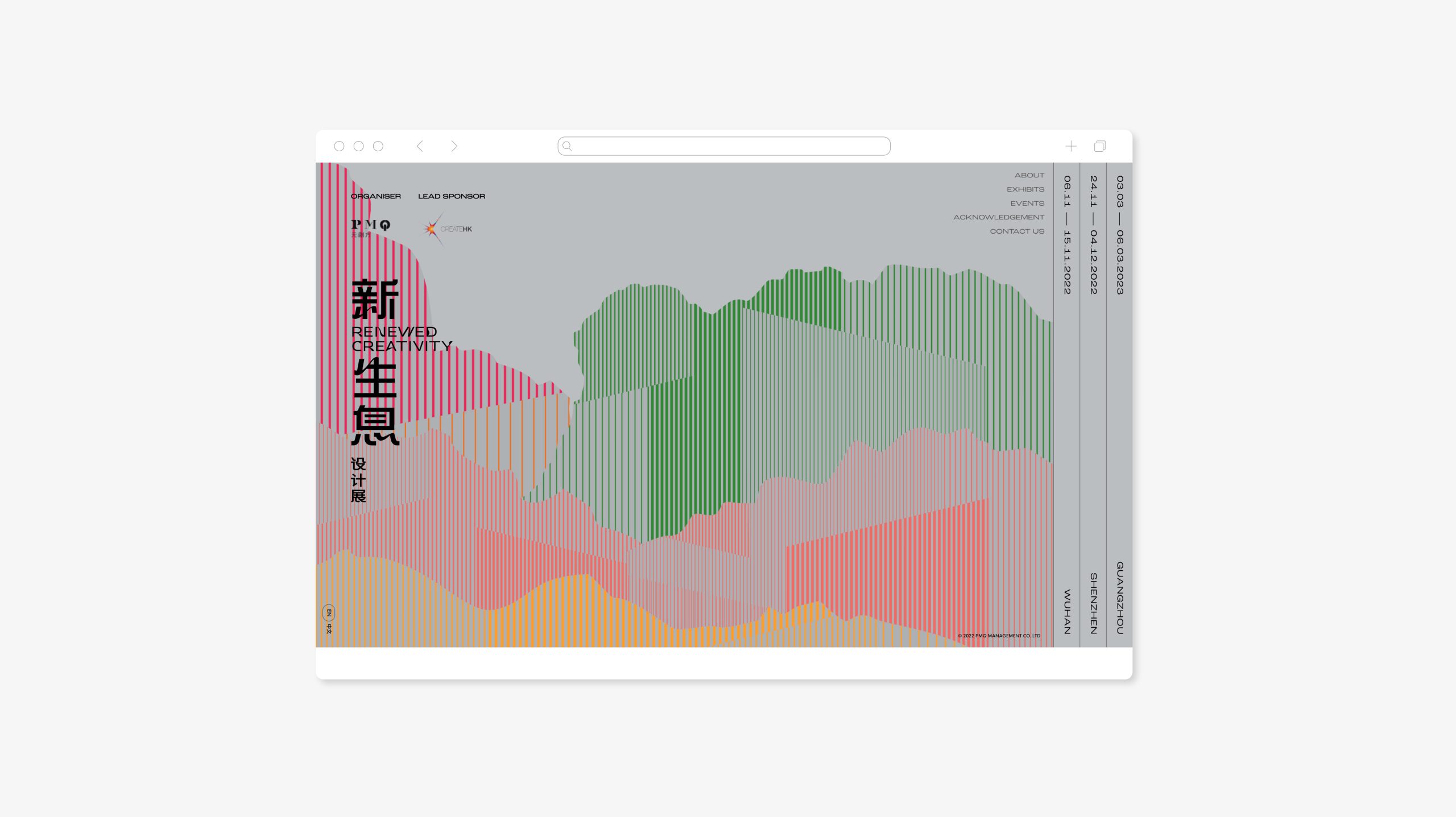
Although Hong Kong is a tiny place, it is a treasure box where multifarious attractions and charming sceneries could be found. Ranging from the tranquil seashore and the green land to the skyscrapers and bustling streets, Hong Kong is a kaleidoscope of scenery. This echoes with the characteristics of Hong Kong as a multi-faceted society where a wide spectrum of cultures converged, showing the diversity and mobility of Hong Kong designs. In view of this, Ztory referred to the shape of various mountains in Hong Kong and outlined layered mountain ranges and shorelines by using curved lines with different thicknesses and colours. The design is in response to the project logo where lines are utilized, forming the key visual of this exhibition.
Website Design
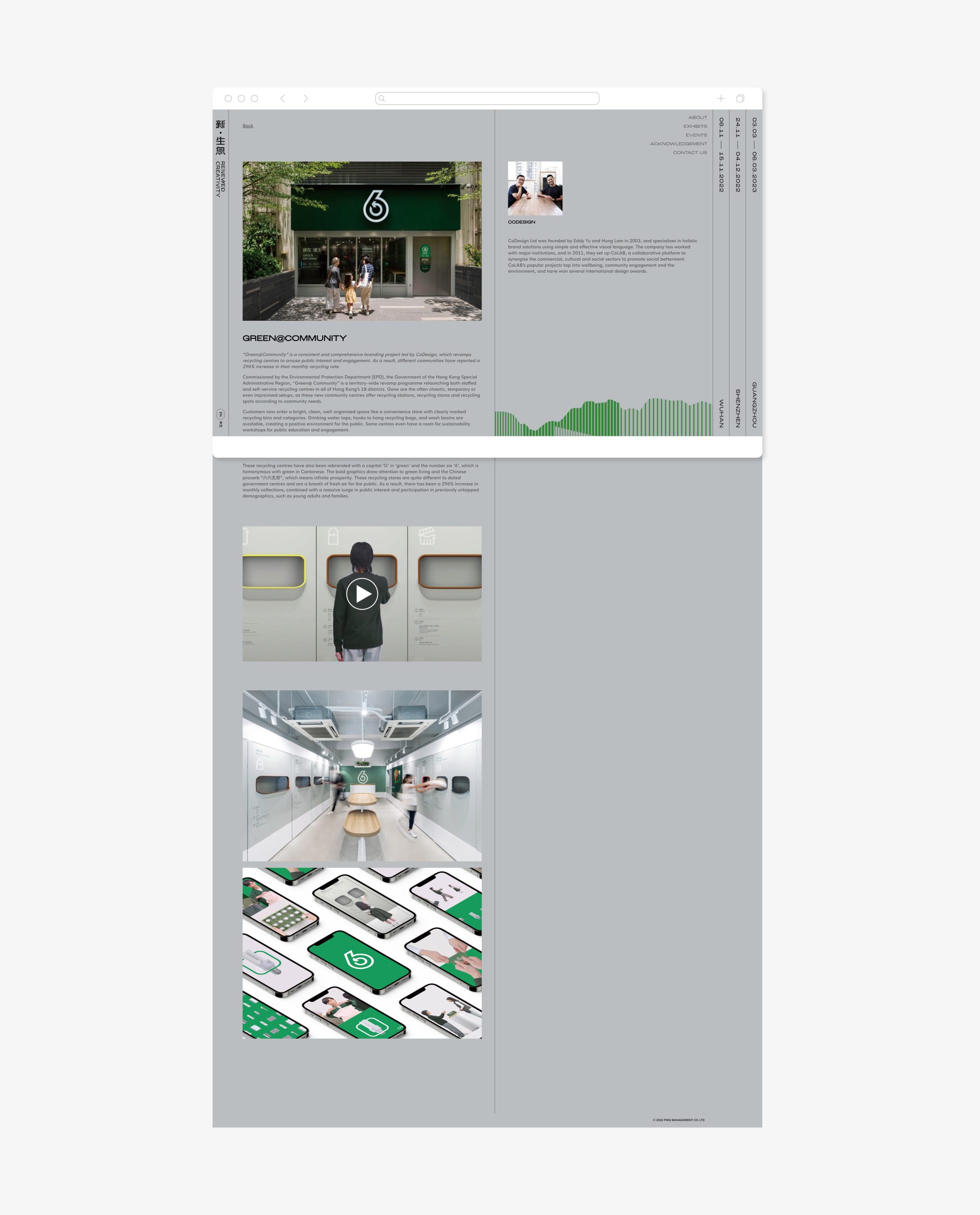
On the other hand, the simple style of key visual was continued with the webpage. The team decided to abandon complicated structures of web interface layers to achieve a clean and clutter-free website. The minimalist page design helps users to navigate and understand easily, bringing a better user experience.
A Final Word
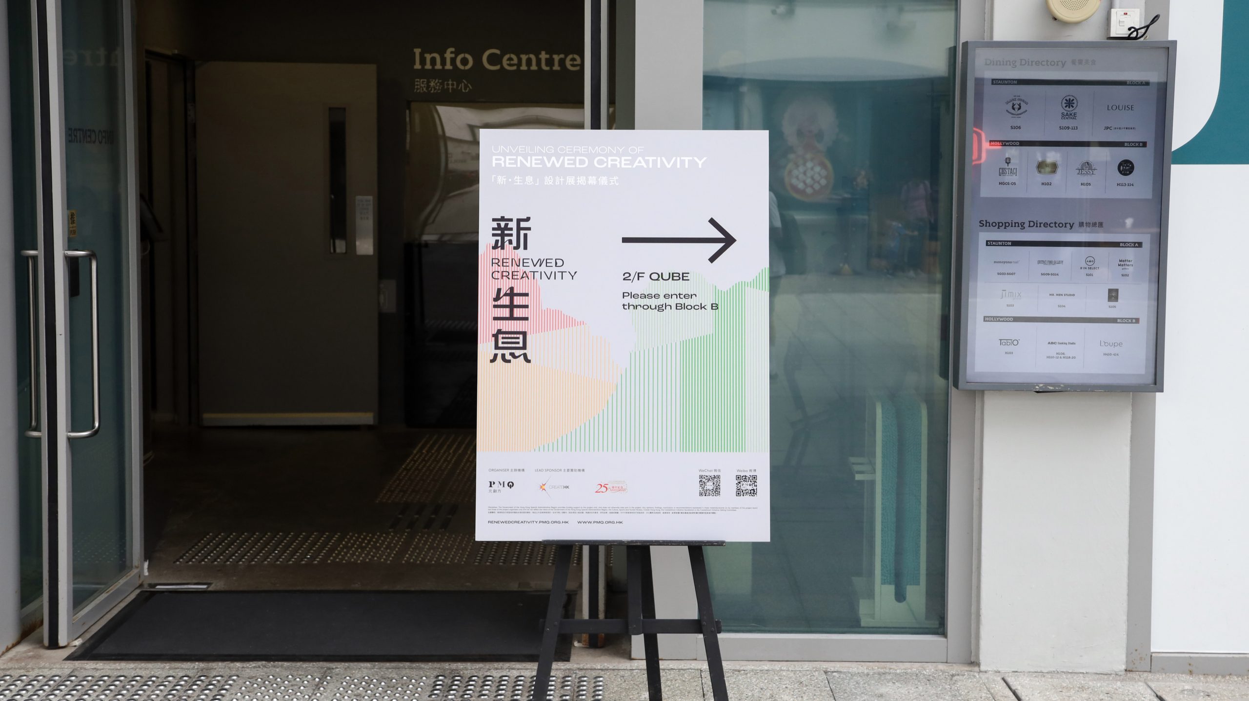
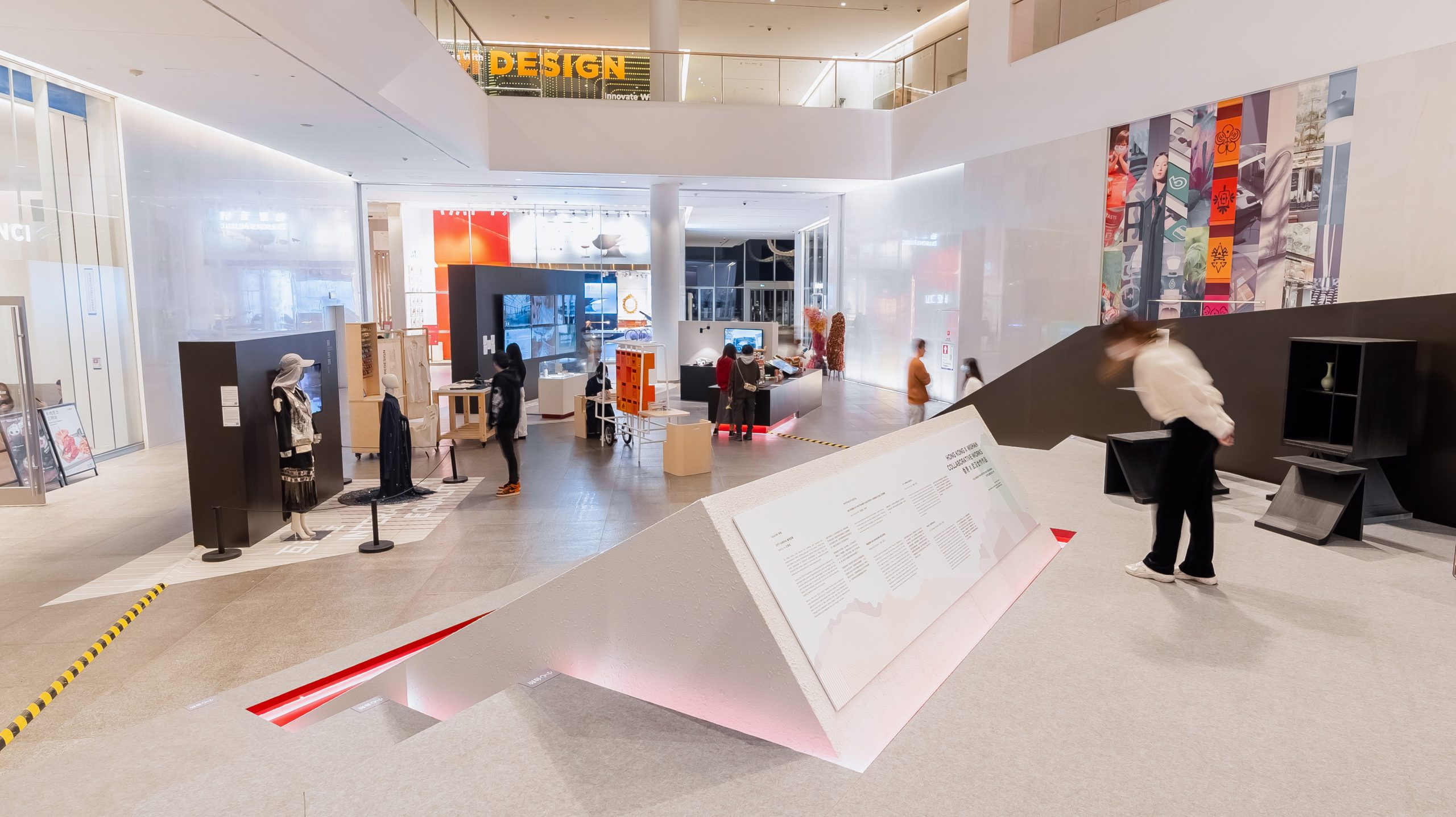
In addition to the webpage, the key visual designed by the team was also used in venue design, online and offline advertising. This reflects a good visual identity of event design, should be aesthetically pleasing as well as practical, in order to be used in different scenes.
