Embracing the Digital Age with Versatile Design
Since its establishment in 2001, Hong Kong Design Centre (HKDC), as a strategic partner of the Government of the Hong Kong Special Administrative Region, has been committed to promoting Hong Kong as an international design capital in Asia through projects like Business of Design Week (BODW), Knowledge of Design Week (KODW), Design for Asia Awards (DFA) and Fashion Asia Hong Kong (FAHK). Eighteen years later, in the light of the digital age, the management would like to renovate the images that the organisation has given for many years.
Client
- Hong Kong Design Centre
What We Did
- Rebranding

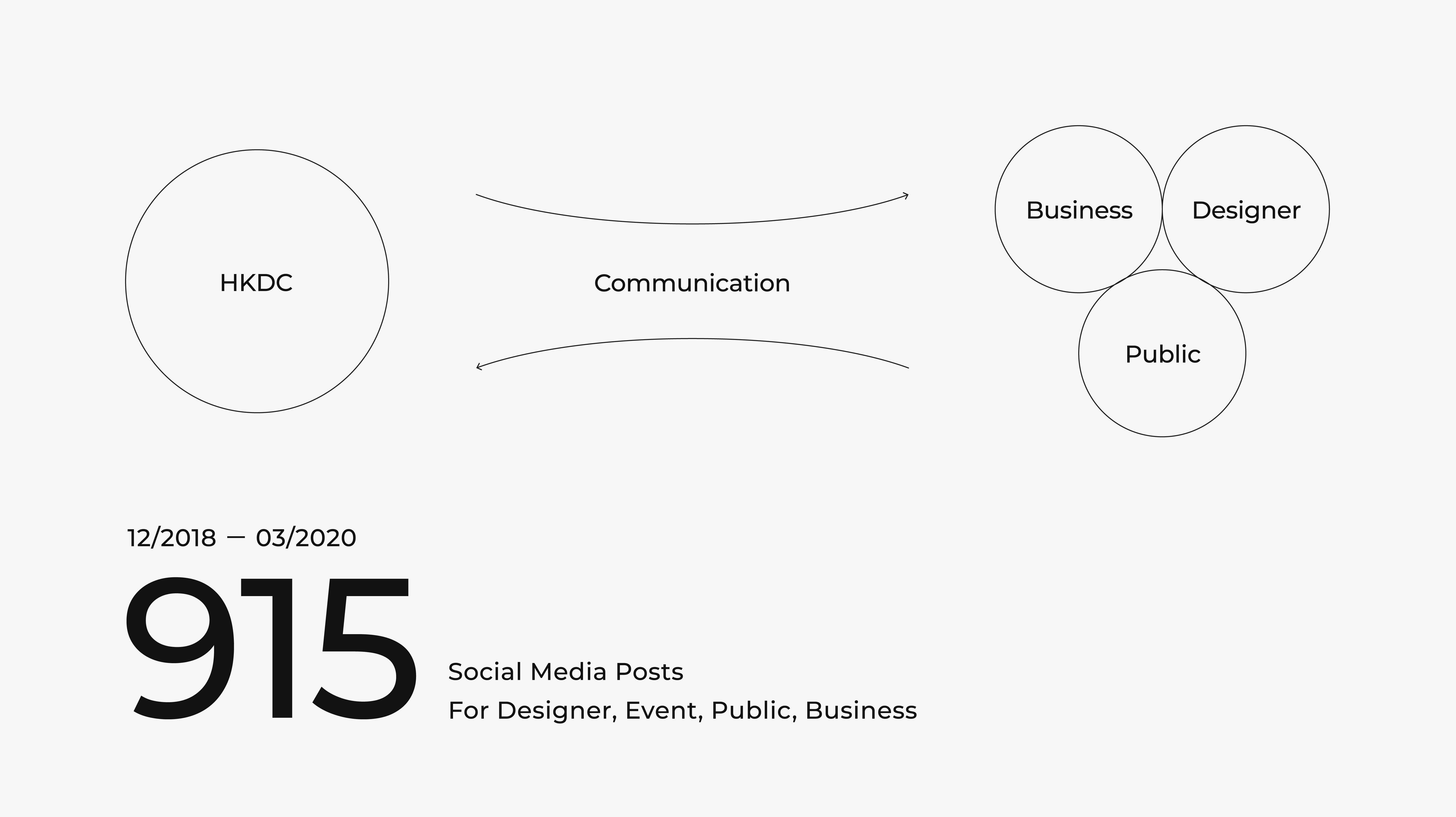
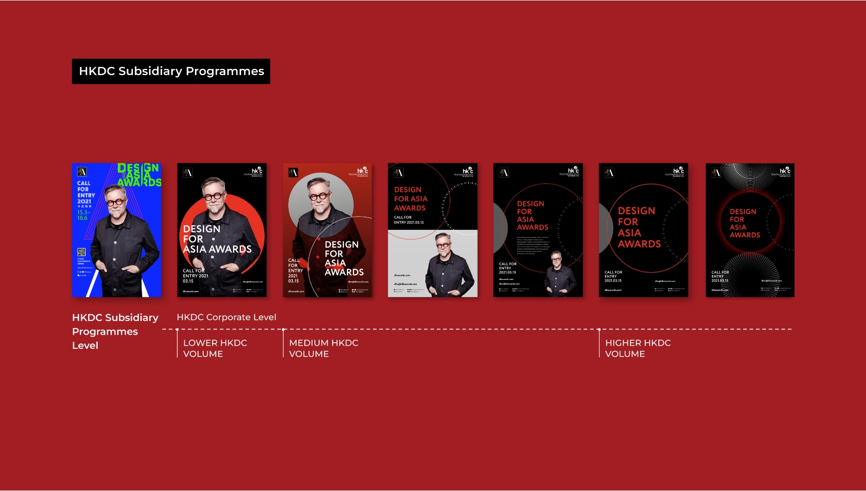
Hong Kong Design Centre has engaged with various groups via social media in the We-media era, with over 900 social posts published between 2018 and 2020. However, Ztory observed that the visual systems of HKDC's numerous projects differ, causing potential confusion when displayed together.
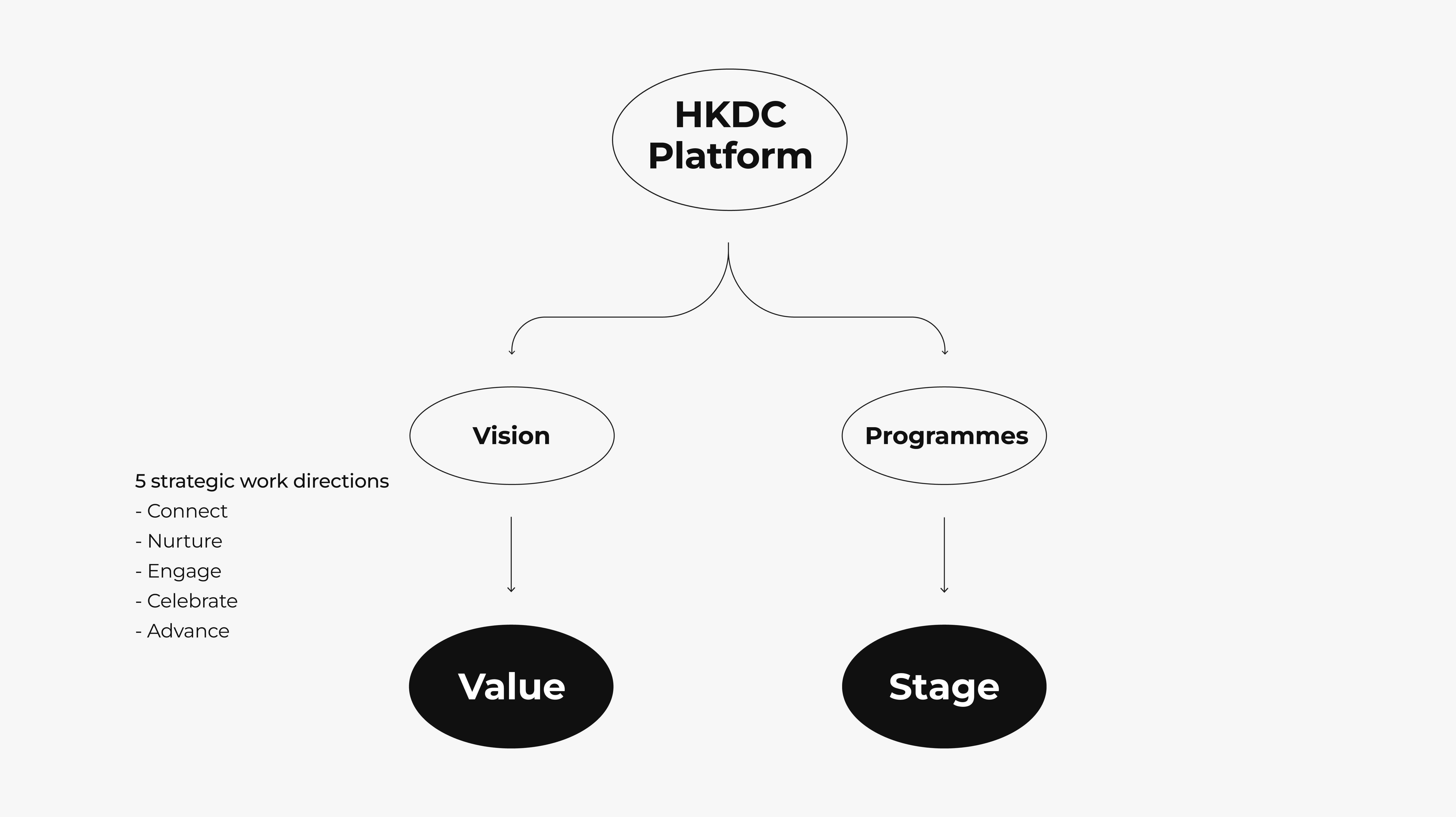
On the other hand, the team also observed that the existing visual image did not fully manifest the position of the Hong Kong Design Centre. In fact, the organisation has been adhering to the five concepts (Connect, Celebrate, Nurture, Advance, Engage). Through different projects and events, HKDC established a platform for the industry to understand, communicate and cooperate with each other, demonstrating the power and value of design.
Design Application
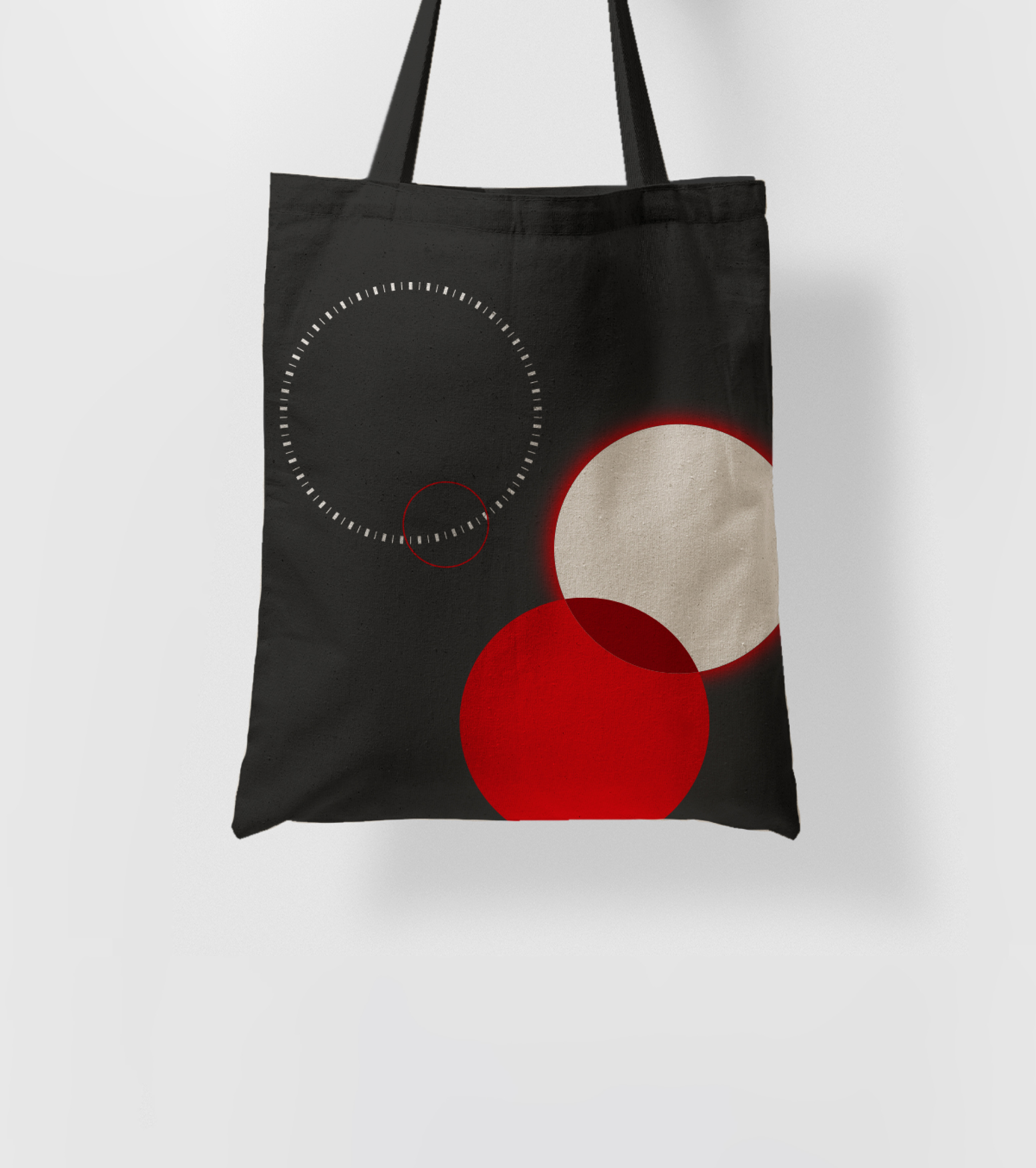
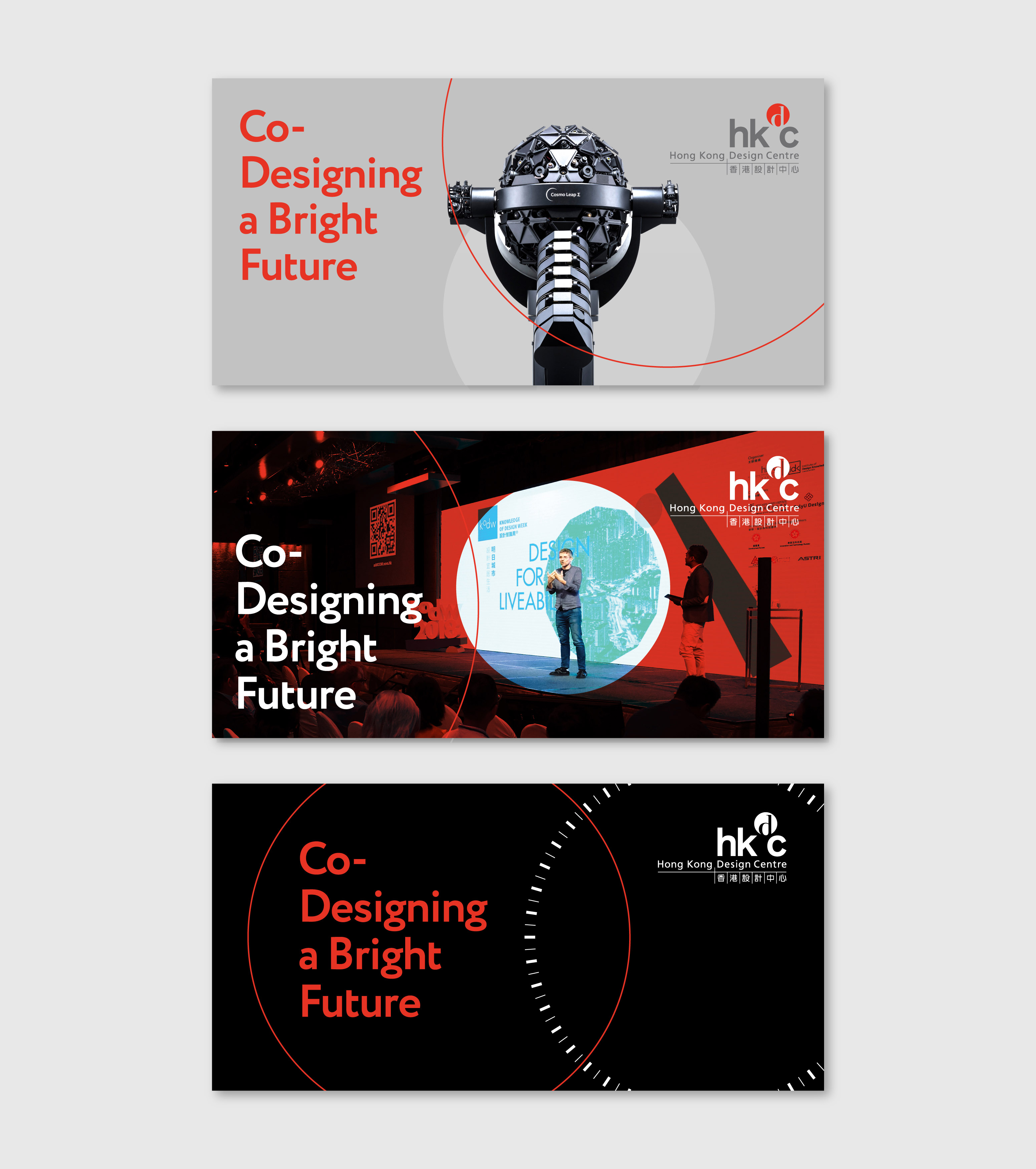
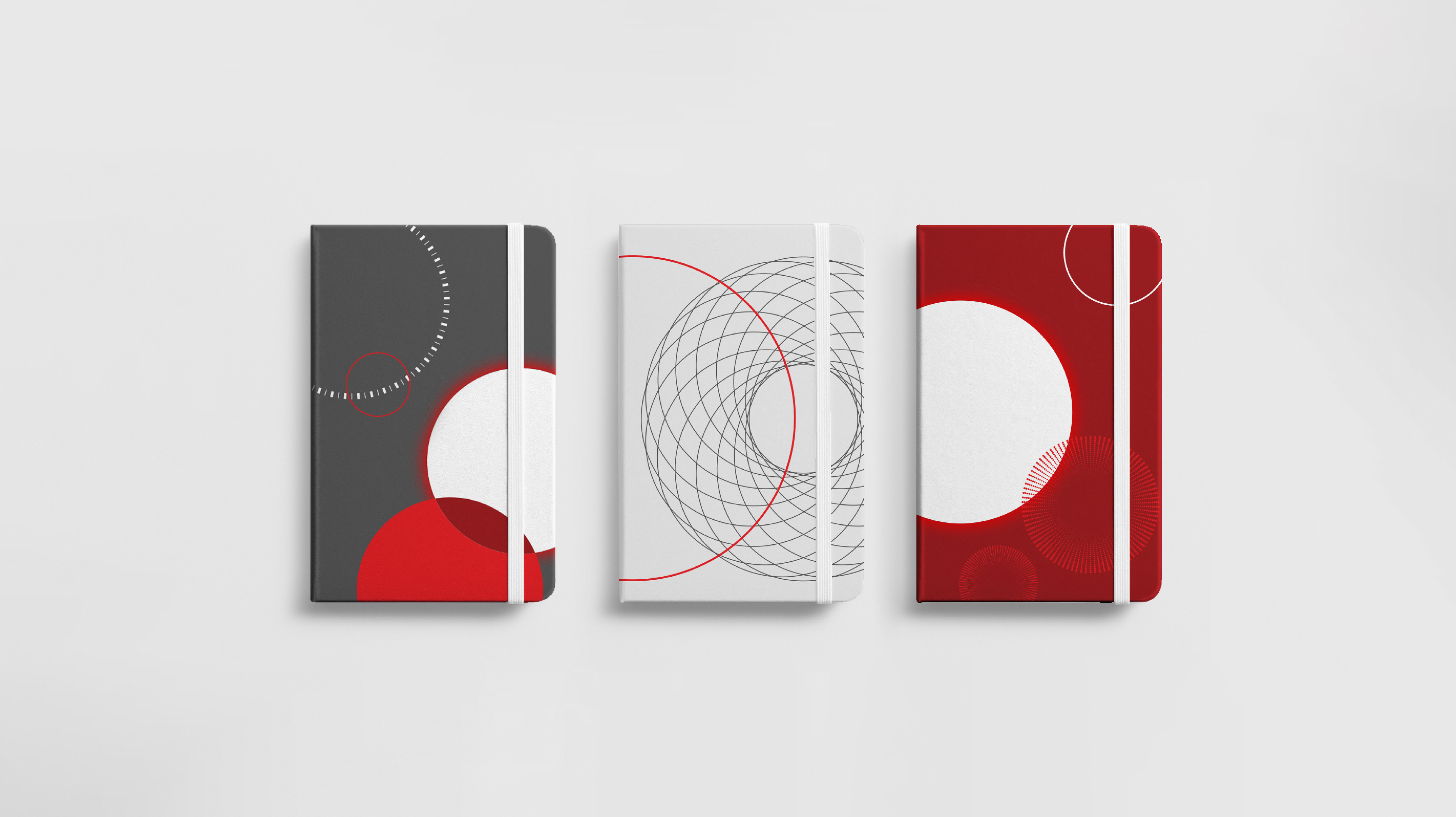
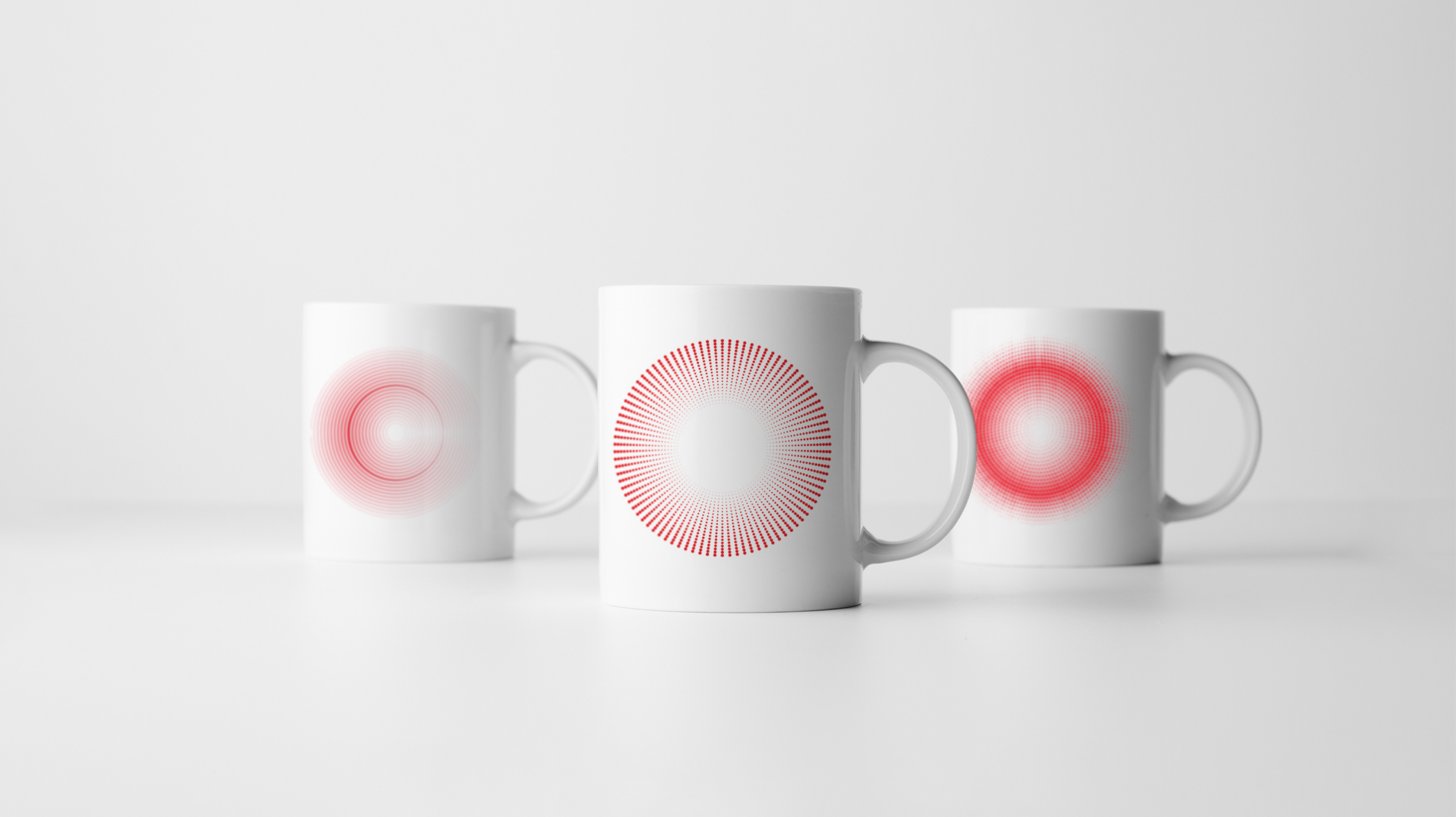
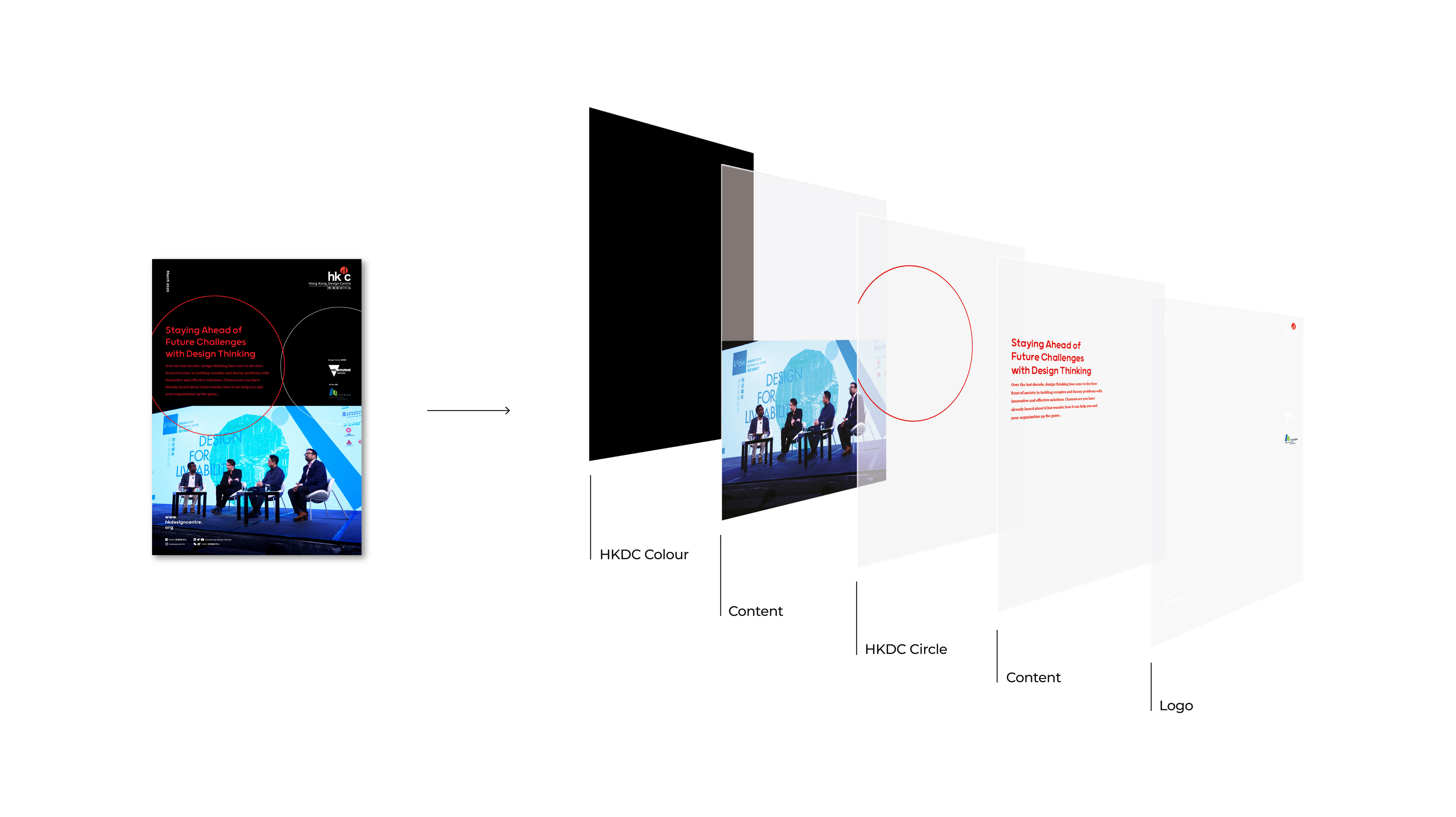
To cater to different needs, Ztory considered the flexibility of the applications of design. The circular elements and the suggested colours should be used freely in different sizes, positioning and colour combinations.
LEARN MORE ABOUT DESIGN APPLICATIONDesign Concept and Element
Ztory proposed using 'Spotlight' to emphasise the Hong Kong Design Centre's pioneering role in the creative industry, by shining a light on each design talent and highlighting the value of design.
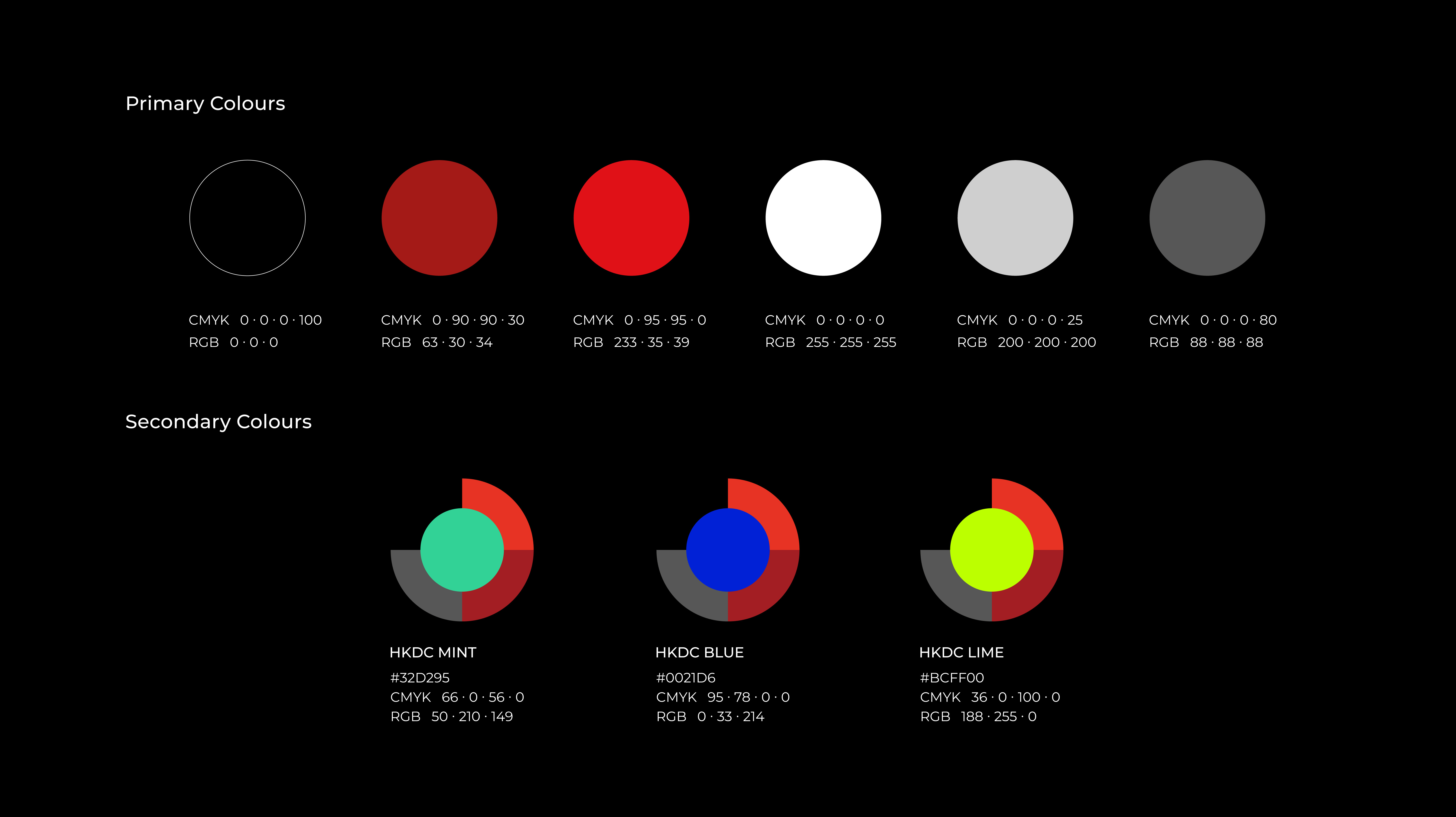
In terms of brand colour matching, Ztory continued to use black, white, red and grey in the official logo as the main colours. Then mint, dark blue and lime were used as supporting colours to enhance richness of the visual, completing the brand image.
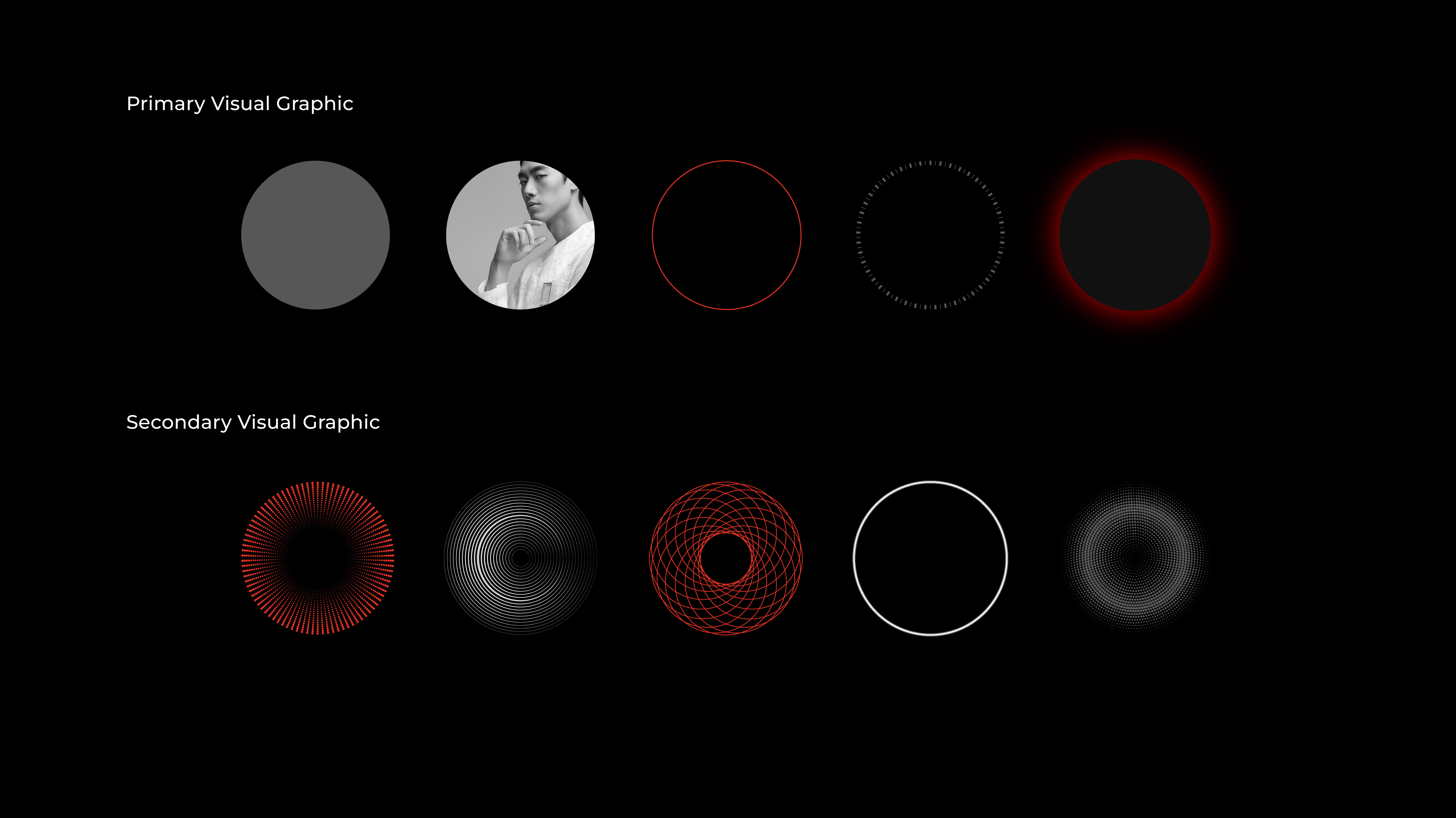
In addition, in order to draw a design policy that is systematic, readable and practical, the team used round colour blocks, coils and repetitive ring patterns as the visual elements, supplemented by a series of auxiliary graphics. The team also selected a variety of Chinese and English fonts for different purposes.


Brand Recognition
For different positioning and uses, the proportion of images and photos in the visual elements will be adjusted accordingly to correspond to the brand recognition.
A Final Word
Ztory complements the previous visual image through a versatile design, and gives a sense of stylish and vibrant personality to the organisation. The team hopes that Hong Kong Design Centre can make good use of the new visual image to further polish the organisation's image.


