The Surprising Power of Simple Design
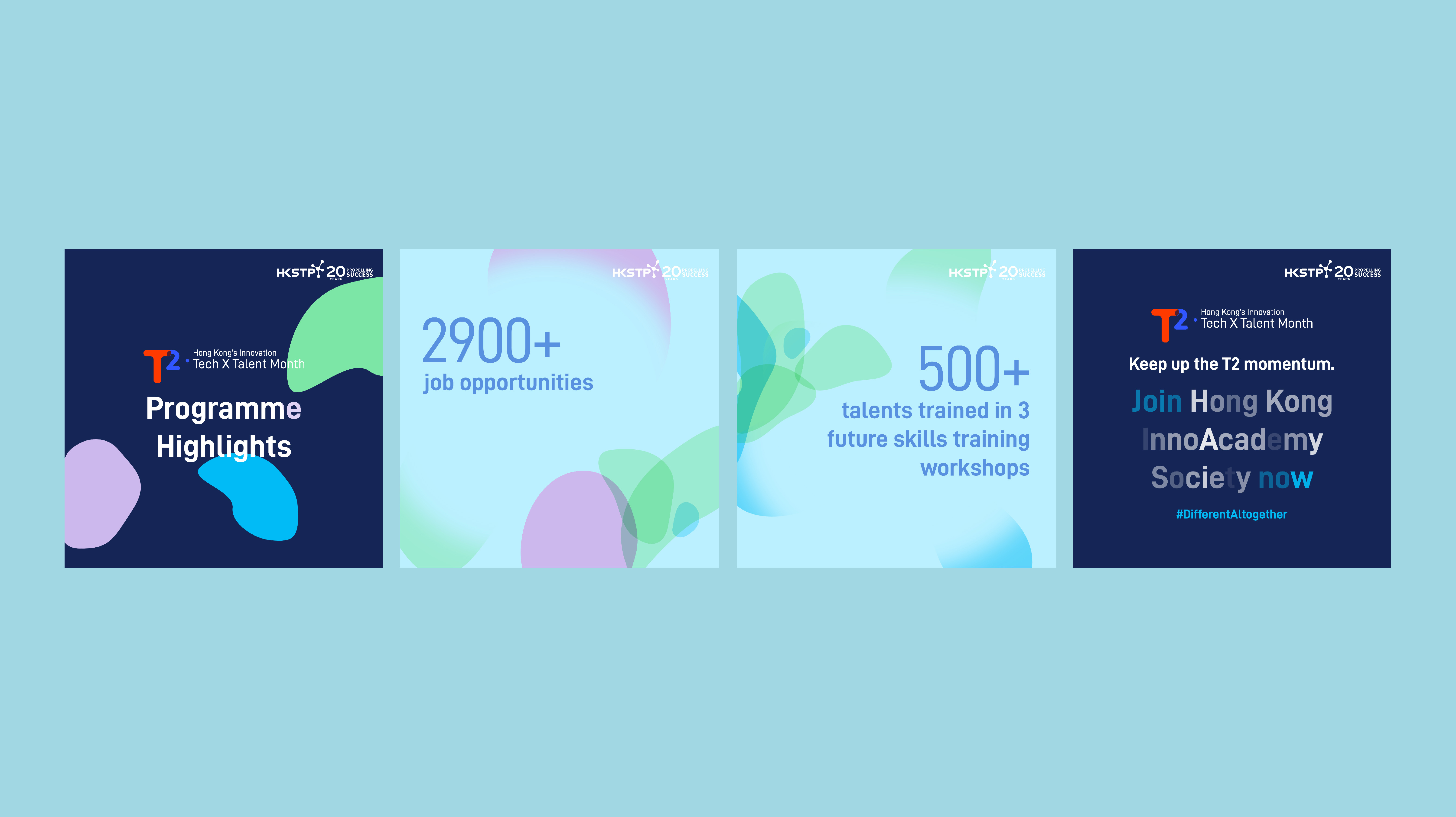
In 2022, Hong Kong Science Park held its inaugural 'T2 – Hong Kong’s Innovation Tech x Talent Month' event with the aim of attracting more talented individuals to the innovation and technology industry. The event featured job fairs, industry training, and seminars. Ztory was commissioned to design the project’s key visual and logo.
Client
- T2 – Hong Kong’s Innovation Tech x Talent Month
What We Did
- Brand Identity
Design Concept
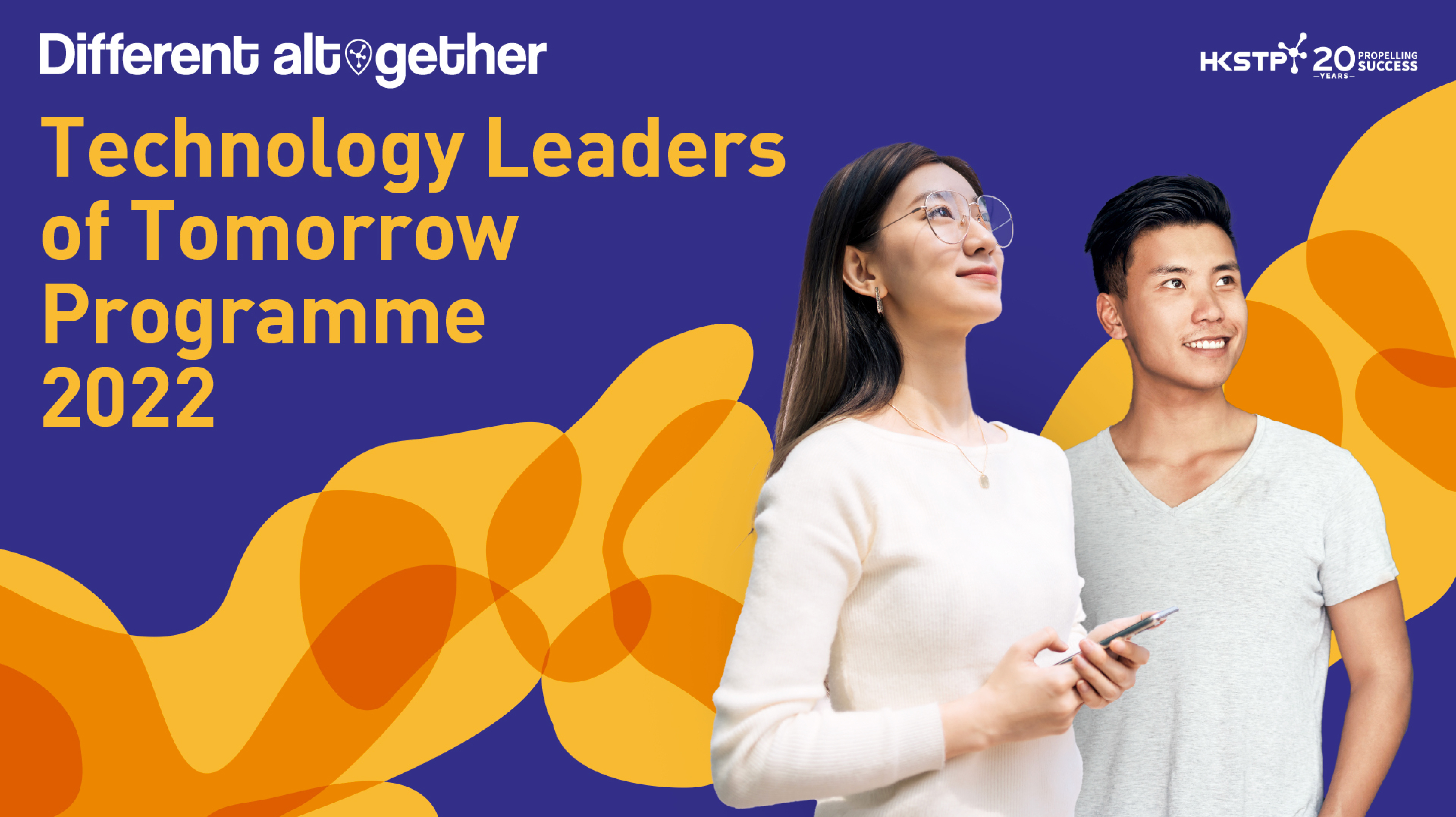
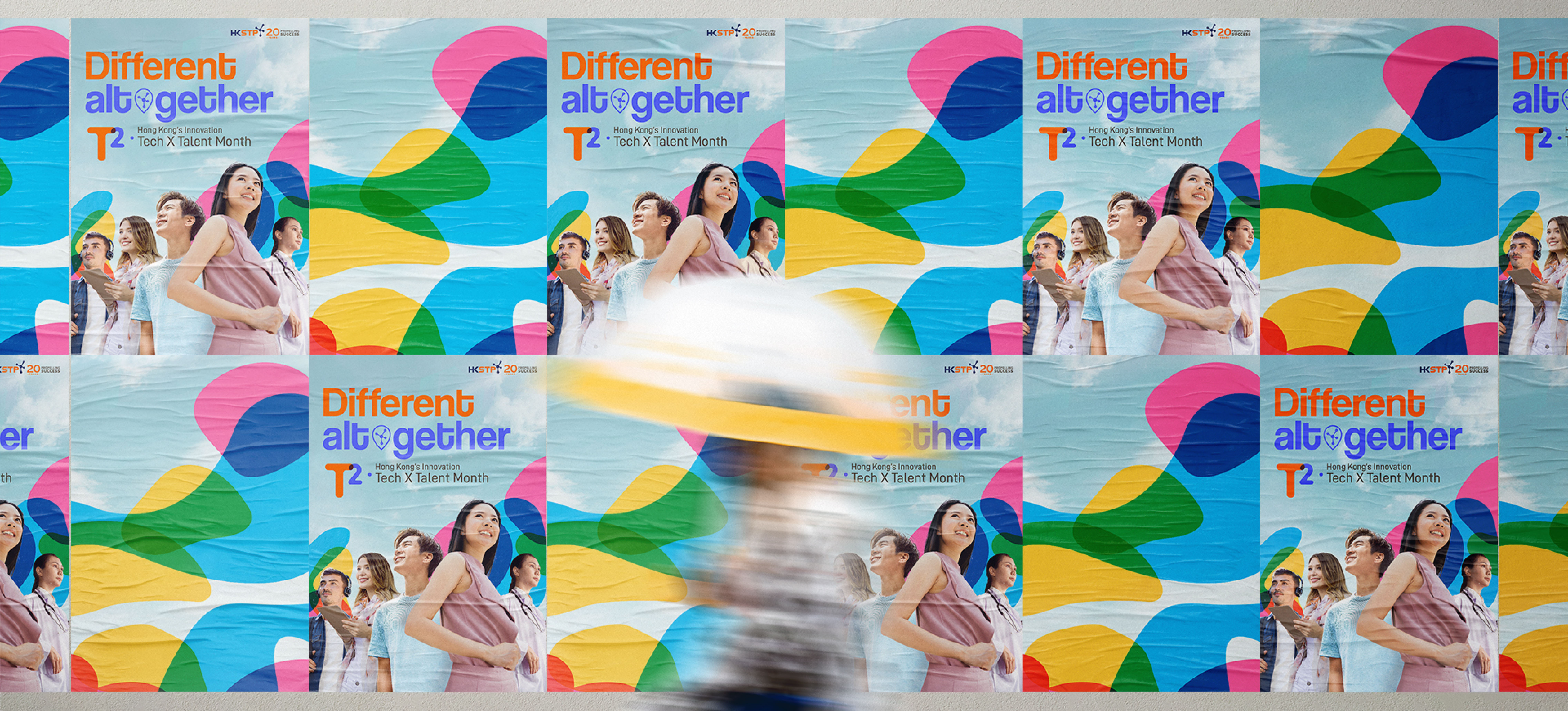
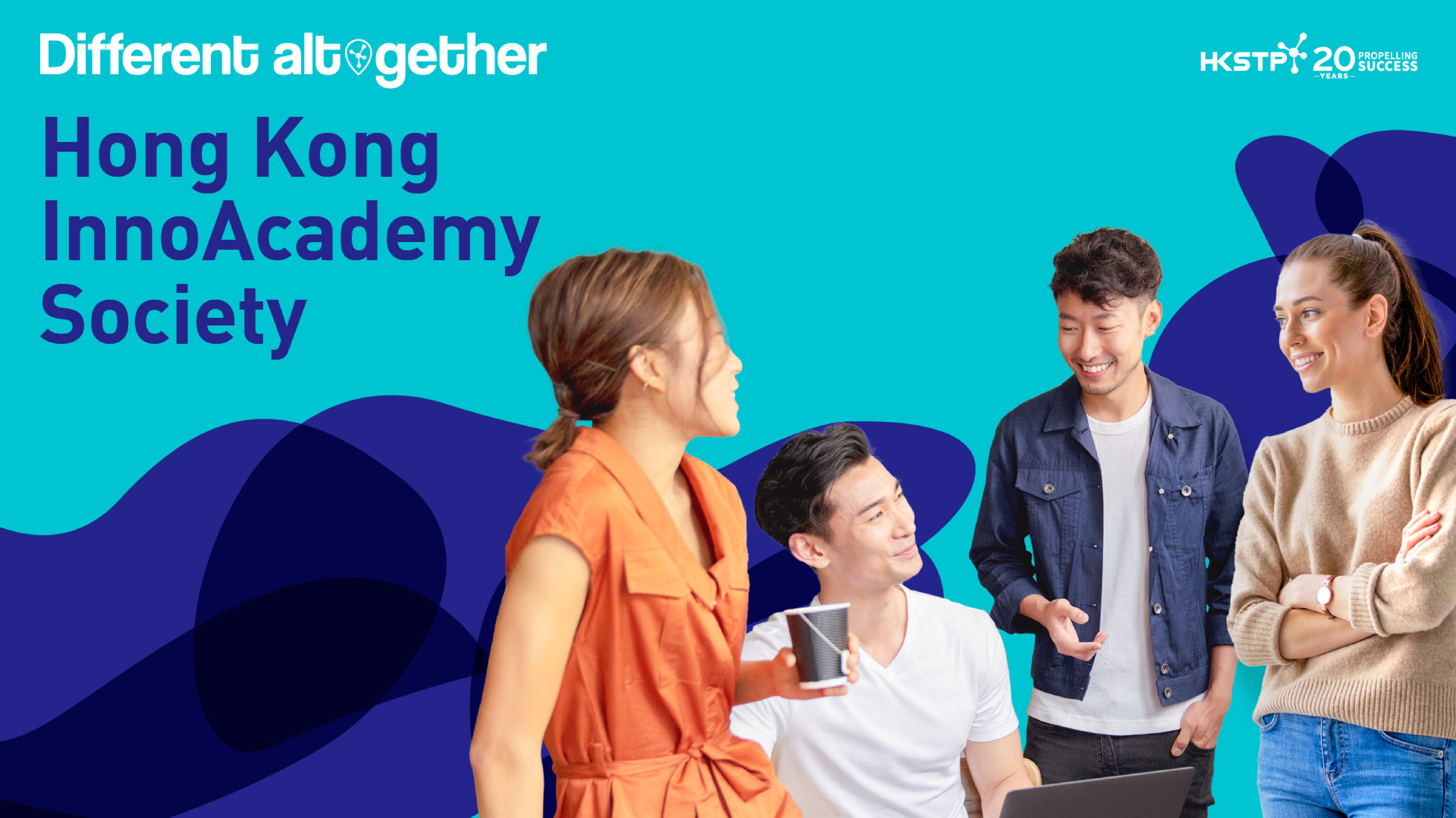
The key visual features a blue sky and white clouds background, accompanied by a large number of streamlined patterns and youthful faces as decorations. All patterns move forward in the same direction, symbolising the gathering of beliefs, resources, and ideas. Faces of different nationalities are used to reflect the international characteristics of 'T2'. As for the logo, the team adopted text-based design, overlapping the two words 'T2' in the project name, which is clear and easy to understand, while also demonstrating the concept of multi-party cooperation in the project.



A Final Word
Ztory's concise and powerful design gives 'T2 – Hong Kong’s Innovation Tech x Talent Month' a professional and dynamic personality, and fully reflects the project's positioning and value. As for a brand-new project, a simple and direct design not only quickly leaves a deep impression, but also makes it easier for people to understand the underlying ideas and meanings.
